Print designs & brochures for clients – a small showcase
In this blog post, we want to summarize a few works with a focus on print design for clients. Look forward to the small showcase of professional flyers, high-quality exposés and image brochures, creative coloring books, and illustrative print media.
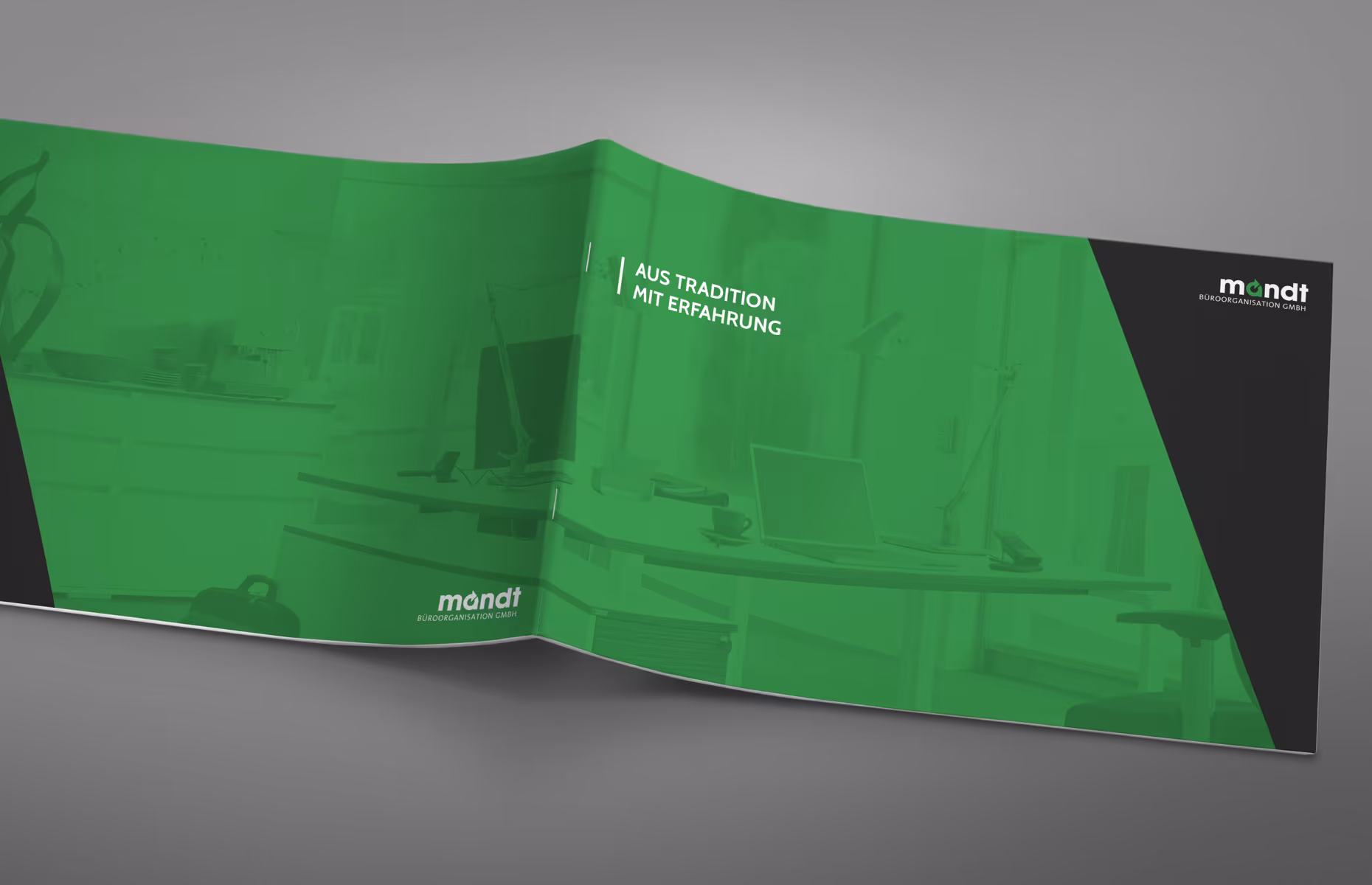
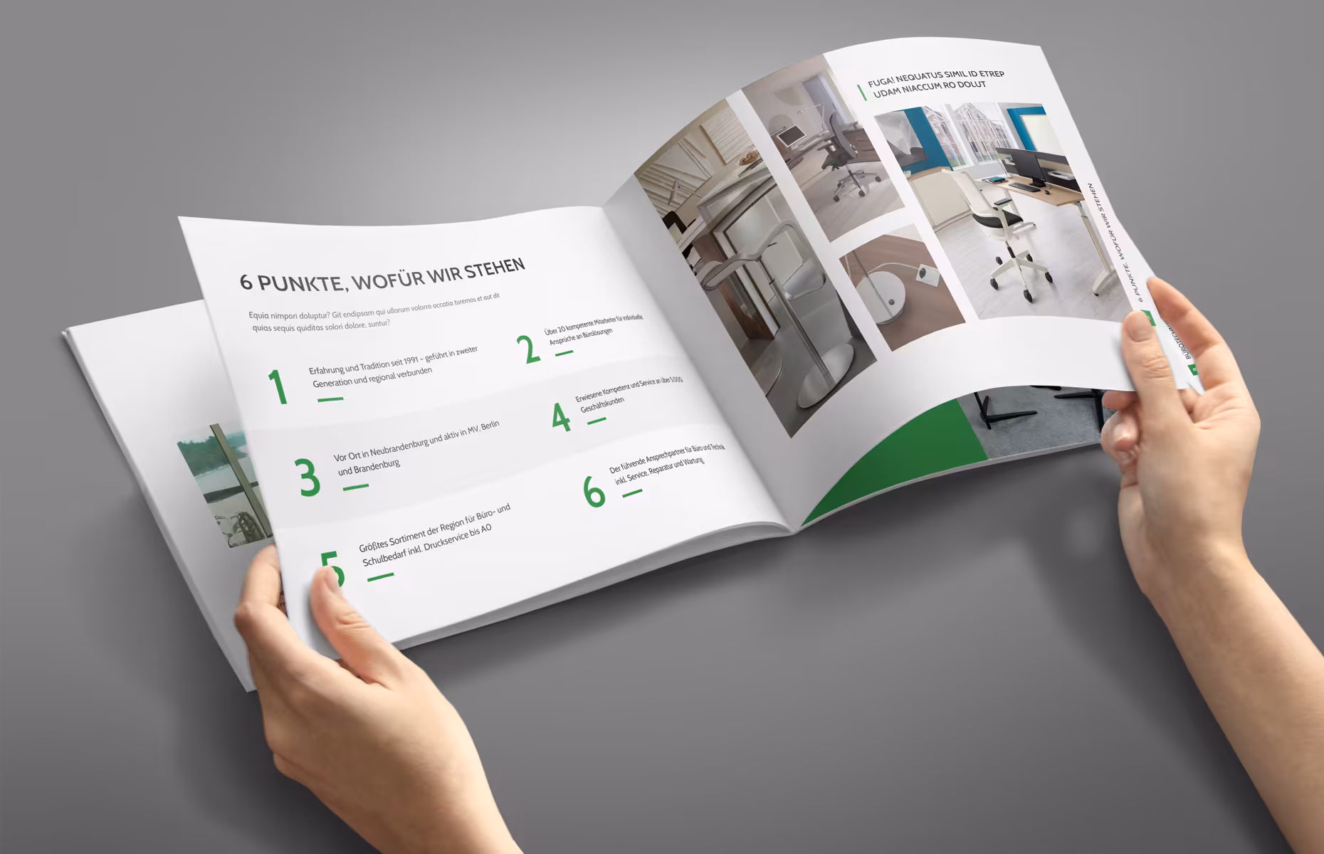
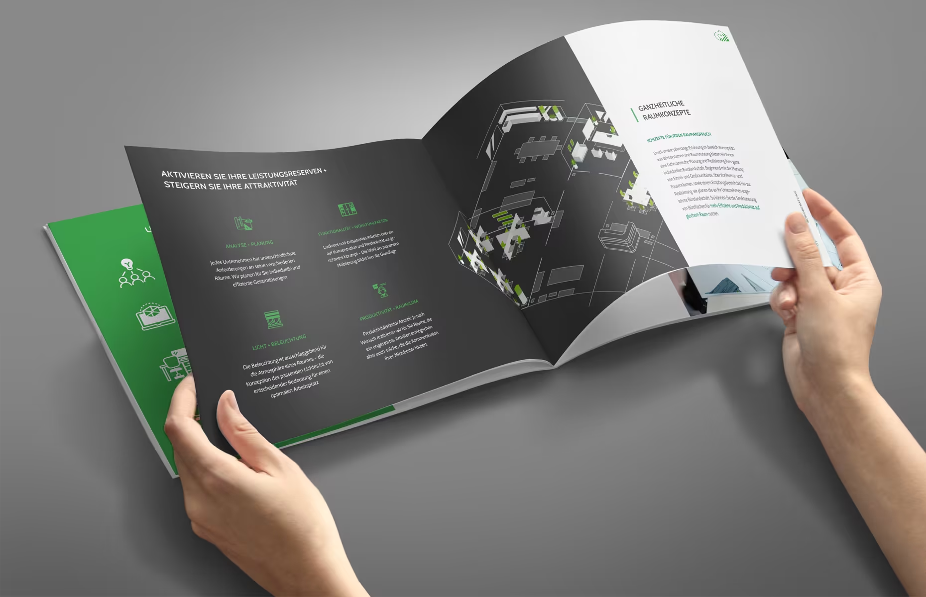
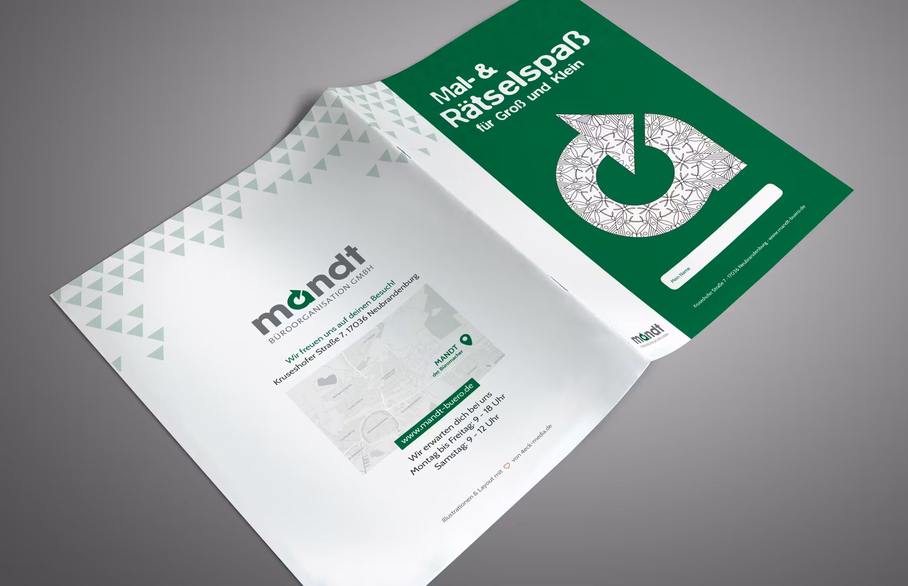
Print designs for Mandt Büroorganisation GmbH in Neubrandenburg.
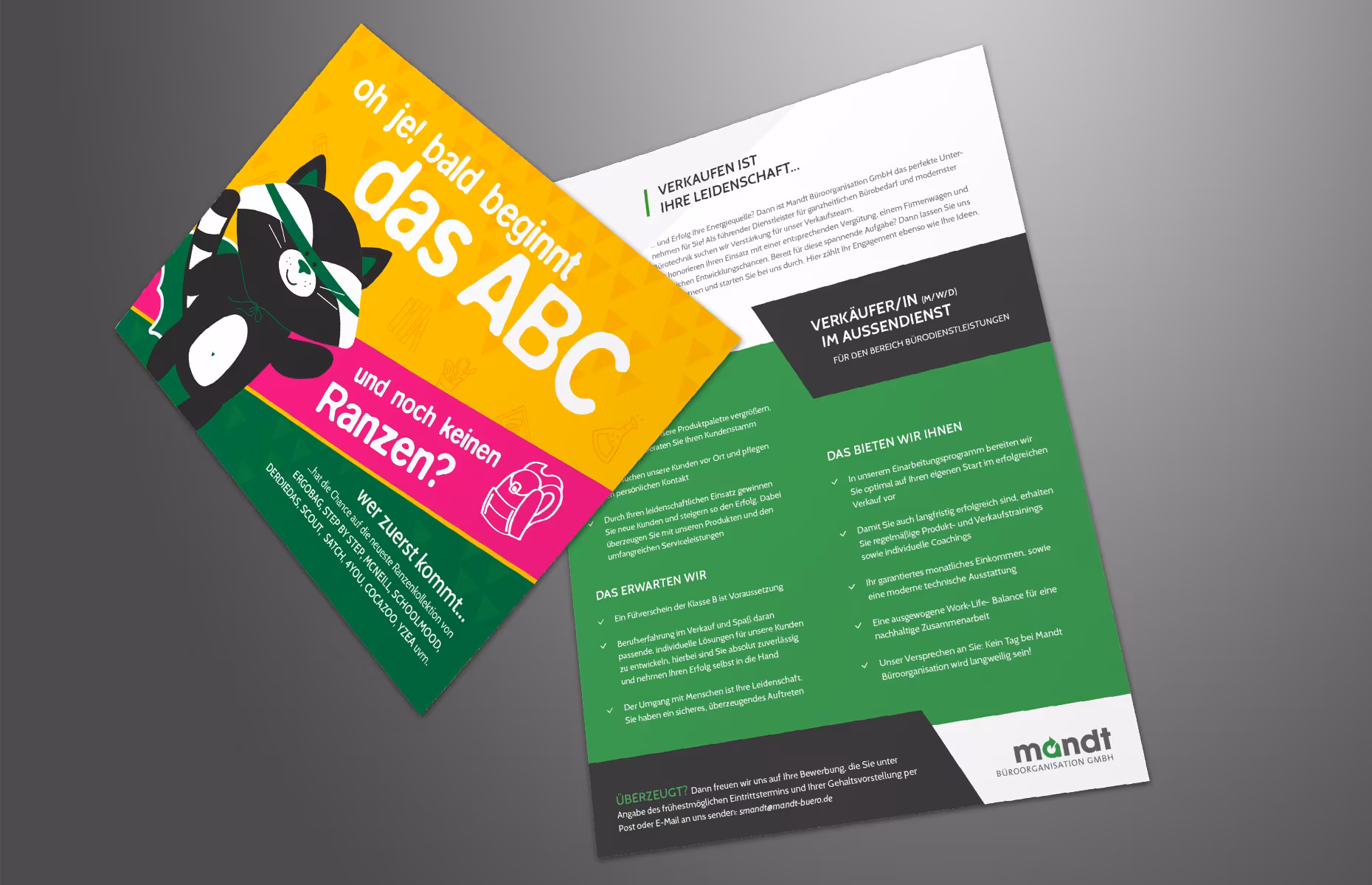
The color combination of dark gray, green, and white makes the design elements look modern, clear, and competent. Both the websites and print products like image brochures, coloring books, postcards, and job advertisement layouts do not hold back on large color backgrounds to further emphasize this contrasting look.
Here you can see the image brochure that was finalized this week and is now going to print:
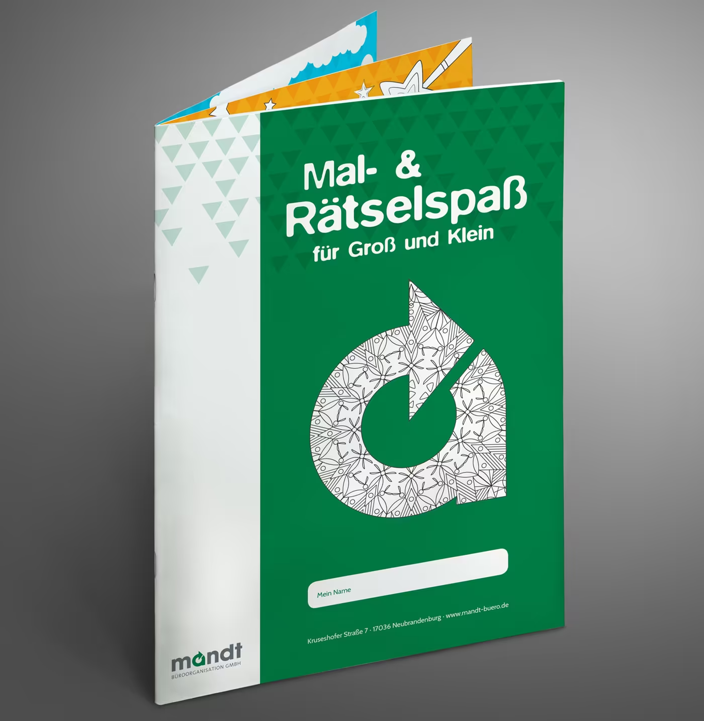
The very cool coloring book with guaranteed puzzle fun has been completed in time for the start of the holidays. Mandt is one of the largest suppliers of school supplies and is collecting additional service points with this coloring book alongside its already extensive range for students and parents.


Here you can see our postcard promoting the current school backpack campaign, as well as our layout for the vacant positions in the company:
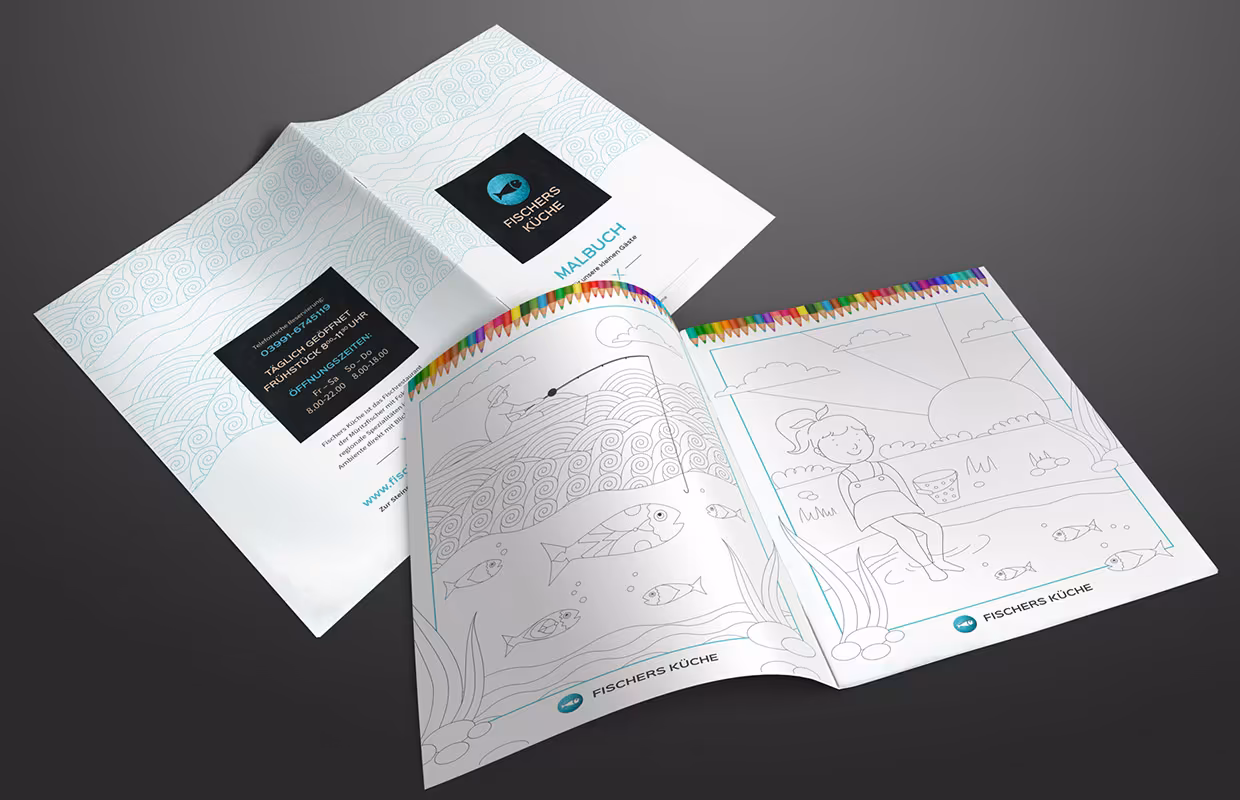
Puzzle book and coloring book for a fish restaurant
A very cool coloring book with guaranteed puzzle fun has been completed on time for the vacation start for our client Mandt Büro from Neubrandenburg – see above. In addition, we had a similar project for a fish restaurant. The coloring book entertains the children in the restaurant in a playful way to shorten the waiting time.
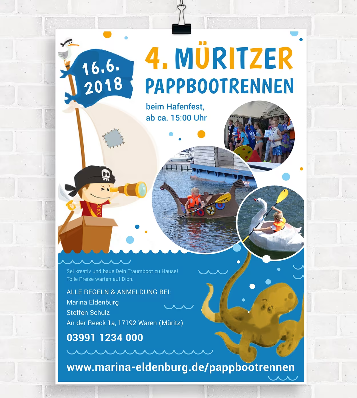
Print products for the Marina Eldenburg
For the Marina Eldenburg, we have realized several print projects. Three of them are as follows: Firstly, the redesign and layout of the holiday brochure. Then, a folded flyer and a poster.
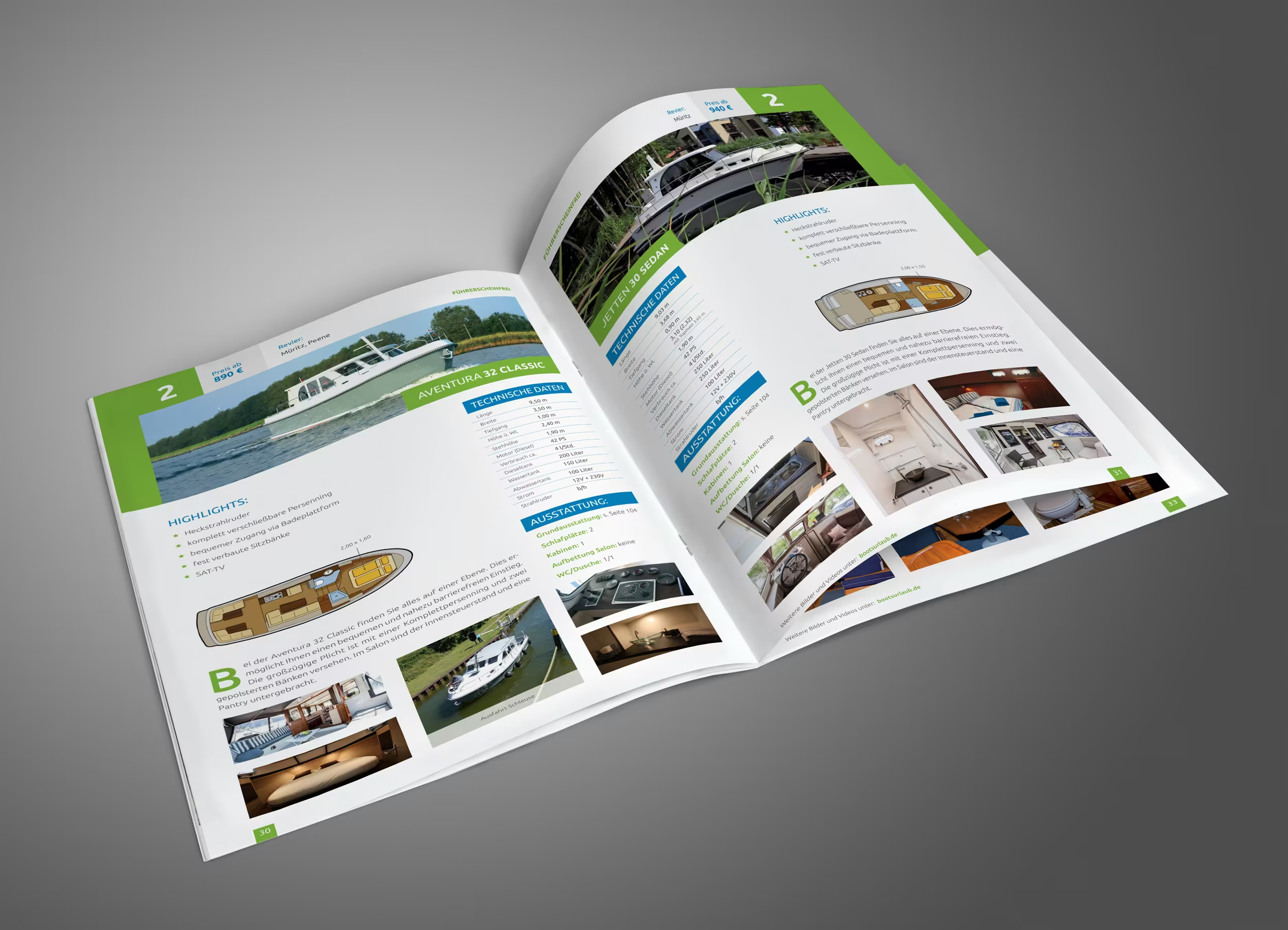
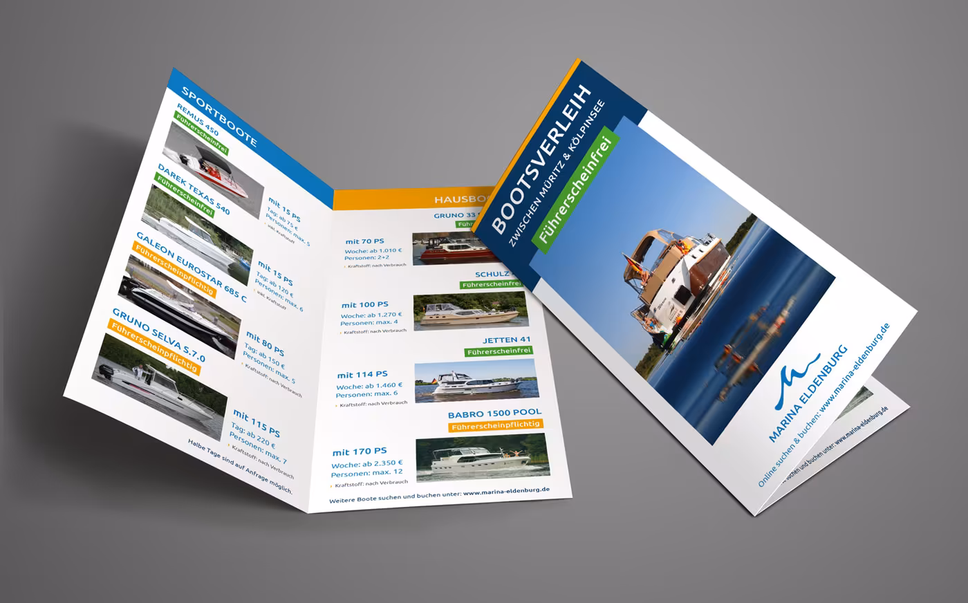
In addition, we developed a 24-page booklet for the Marina Eldenburg. The Marina Eldenburg offers holiday homes and a yacht harbor at the gateway to the Müritz. The holiday resort is located between Müritz and Kölpinsee in a very quiet bay, making it an ideal starting point for a vacation in the heart of the Mecklenburg Lake District. To make the various services transparent, we designed a 24-page booklet – here in the digital mockup view.
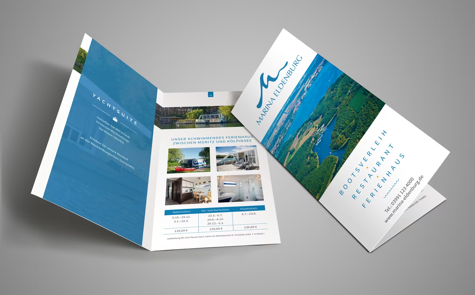
Image brochure for IGN Architects
We designed an image brochure specifically for a key competency of the engineers and architects of IGN Waren. This serves as a print option to target new prospects and potential clients. The brochure provides insight into the urban planning process by IGN across 16 pages in a handy landscape format.


Cross flyers, folded flyers, and property exposé.
In the northeast of Germany, an impressive real estate project has emerged in an exclusive idyll between the Baltic Sea and Bodden on a narrow peninsula. The historic former maritime school in Wustrow on the Fischland-Darß-Zingst peninsula has been revitalized. We were engaged for a variety of marketing and sales measures for the project. In this blog post, we would like to present the first fruits of our work and provide a diverse insight into print and digital for the project.
Those who click through the offerings of large online printing companies often tire quickly after just halfway: roll-ups here, folded flyers there, and of course posters in between. Demanding clients, who want to win viewers not only through the content of their message but also through the medium itself, quickly reach their limits with standard printed materials. Recently, we realized a design concept for a large real estate developer that not only convinces through its content and graphic appeal but also with regard to the medium itself, we chose an extravagant design solution that we developed: the cross-folder – also known as a print-ready star flyer.

The uniqueness lies in the cross folding itself, which expands the visible area upward, to the left, and to the right by one page each, and of course also in the considerable and impressive final size of 889 x 420 mm when unfolded. In total, there are four pages on the front of the printed sheet and another four on the back – each in A4 format! The cross flyer (or star flyer) offers enough space to detail a major project such as the complete renovation of a property and the construction of additional apartment buildings. Regarding the design: The logical structure of the page layout and the accompanying (and deliberate) visual guidance leads the viewer step by step through the individual stages, while constantly highlighting how striking and extraordinarily eye-catching the printed product is.
When folded, the Star Flyer fits perfectly into any DIN A4 mailing bag with its practical dimensions of 297 x 210 mm, including the customer letter. For a high-quality feel in terms of texture and material, we used 350g/m² professional silk paper and had it coated all around with a primer and refined with a double-sided glossy foil by the printing company. This protects the surface and enhances the impact and brilliance of the images, which is certainly desirable. Additionally, the paper adds to its grip and strength. Our client obviously did not have to fold and shape the print sheets themselves, as the printing company took care of the folding professionally. Likewise, it was a given that the special printing form would be scored, punched, and cut.

We are very proud of this modern and eye-catching design work and print format, which will appeal to our agency client and, above all, to their customers, meaning the future prospects. At the same time, we will also design and print classic printed materials such as six-page folded flyers and multi-page property exposés for the major sales launch of the vacation apartments. However, this printed cross flyer will remain positively in our memory.
While the cross-folder is intended for shipment to selected target customers, there will also be the opportunity to get information about the construction project on-site at the construction sign, on the construction container, and at frequently traveled paths in the regional environment. For this purpose, we have designed a folded flyer, which will be available in large quantities in flyer boxes for interested parties to take.

Given the size of this project, it quickly becomes apparent that we have our hands full as well. Throughout the months, numerous media for print and web have been created. Not only were the showcased contents convincing, but we also came up with something very special regarding material selection and paper formats. Recently, we reported on the unique cross-folder with eight pages in another blog article. Additionally, there is now a forty-page real estate exposé with perfect binding, partial relief finishing on the outer sides, and transparent paper in the inner section, which provides a clear before-and-after picture of the former building.


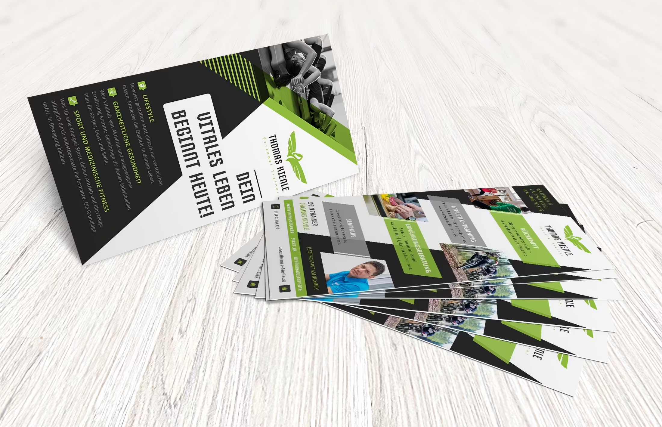
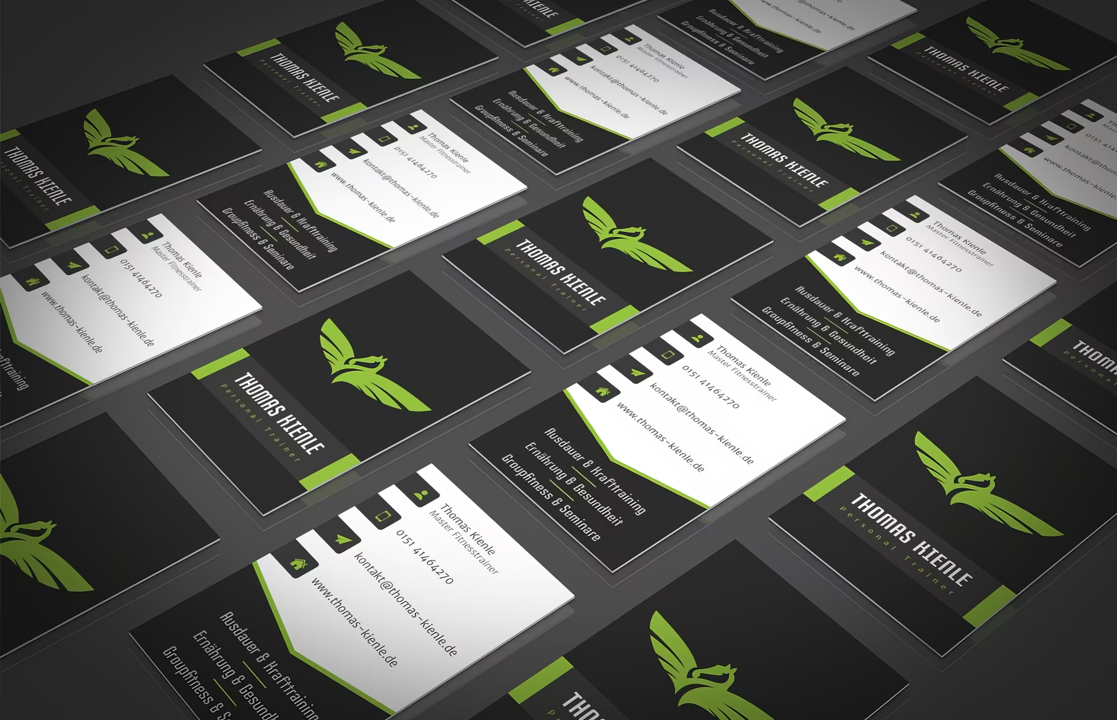
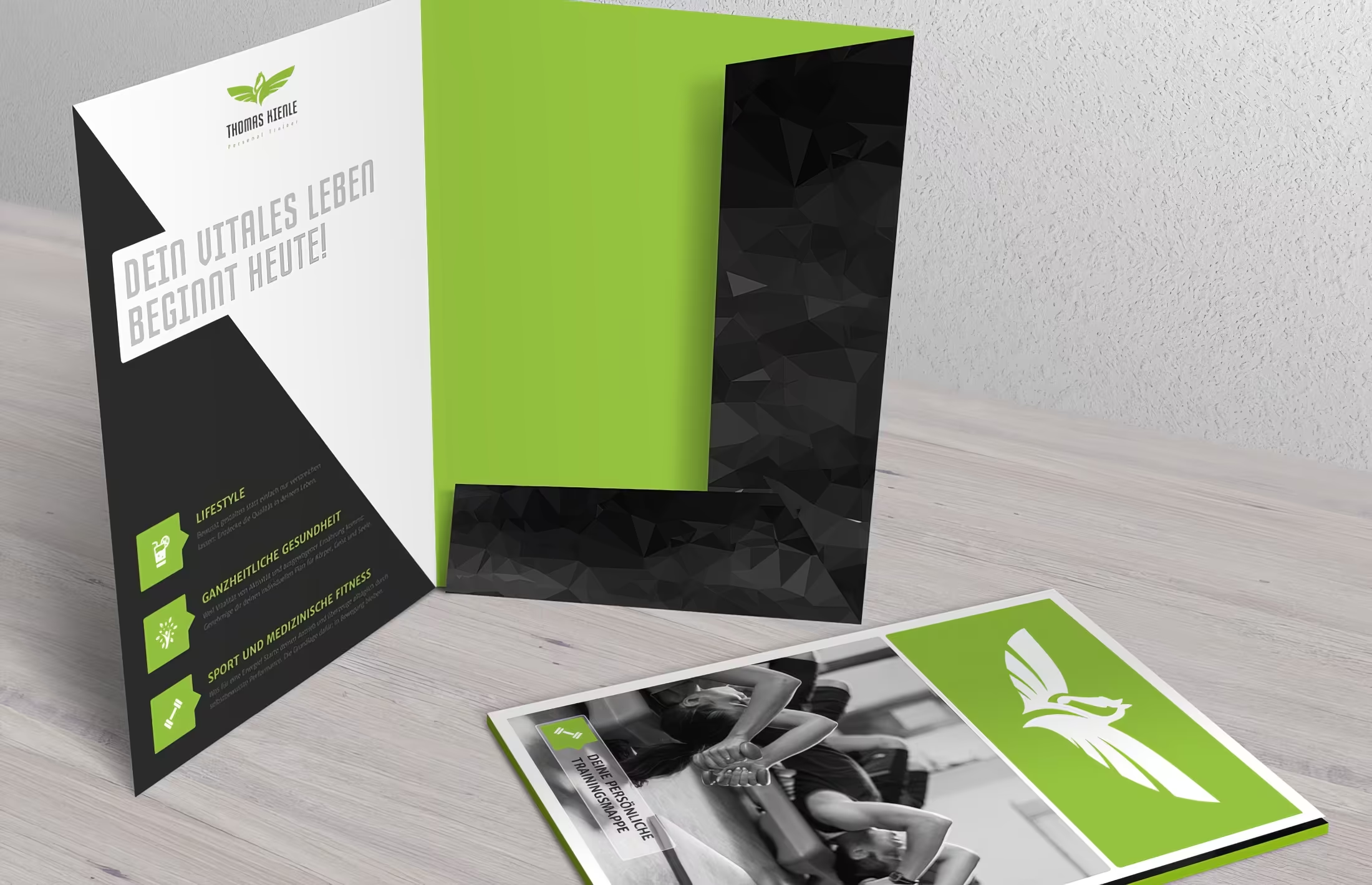
Print designs for personal trainers
We love our job. Also because we work with people who are passionate about what drives them every day. In one of our recent projects, we developed complete branding for Sascha Serbolandi, a personal trainer and nutritionist who grew up as an athlete and martial artist (taekwondo and kickboxing). In addition to the corporate identity, we designed and developed the website, business cards, letterhead, and modern folders. How do you take down a kickboxer? With athletic design!

For another personal trainer from the Allgäu region, we created a look that is rich in pixels and has been shining in a vibrant fresh green since the end of March. Once the highly distinctive corporate identity was defined in all its facets, we moved on to preparing various media for print and web. You can tell that with spring, the spirit of sports awakens, because just a month earlier, we completed the project for Sascha, who is also active as a personal trainer. The same theme, two completely different approaches to execution. Design is indeed that diverse.

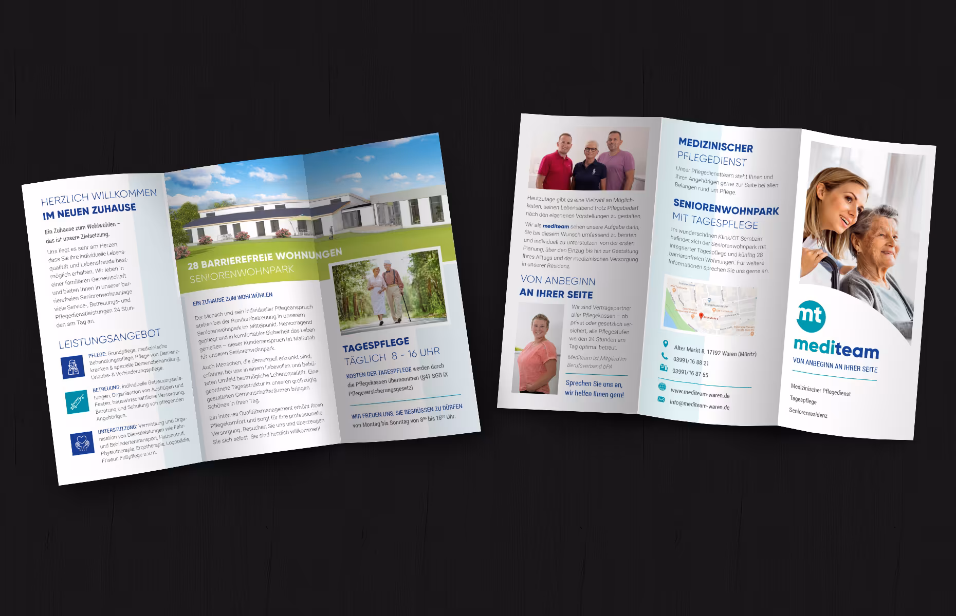
Flyer and manual
For the care company Mediteam, for which we were also allowed to design the new brand, we created a modern folded flyer.
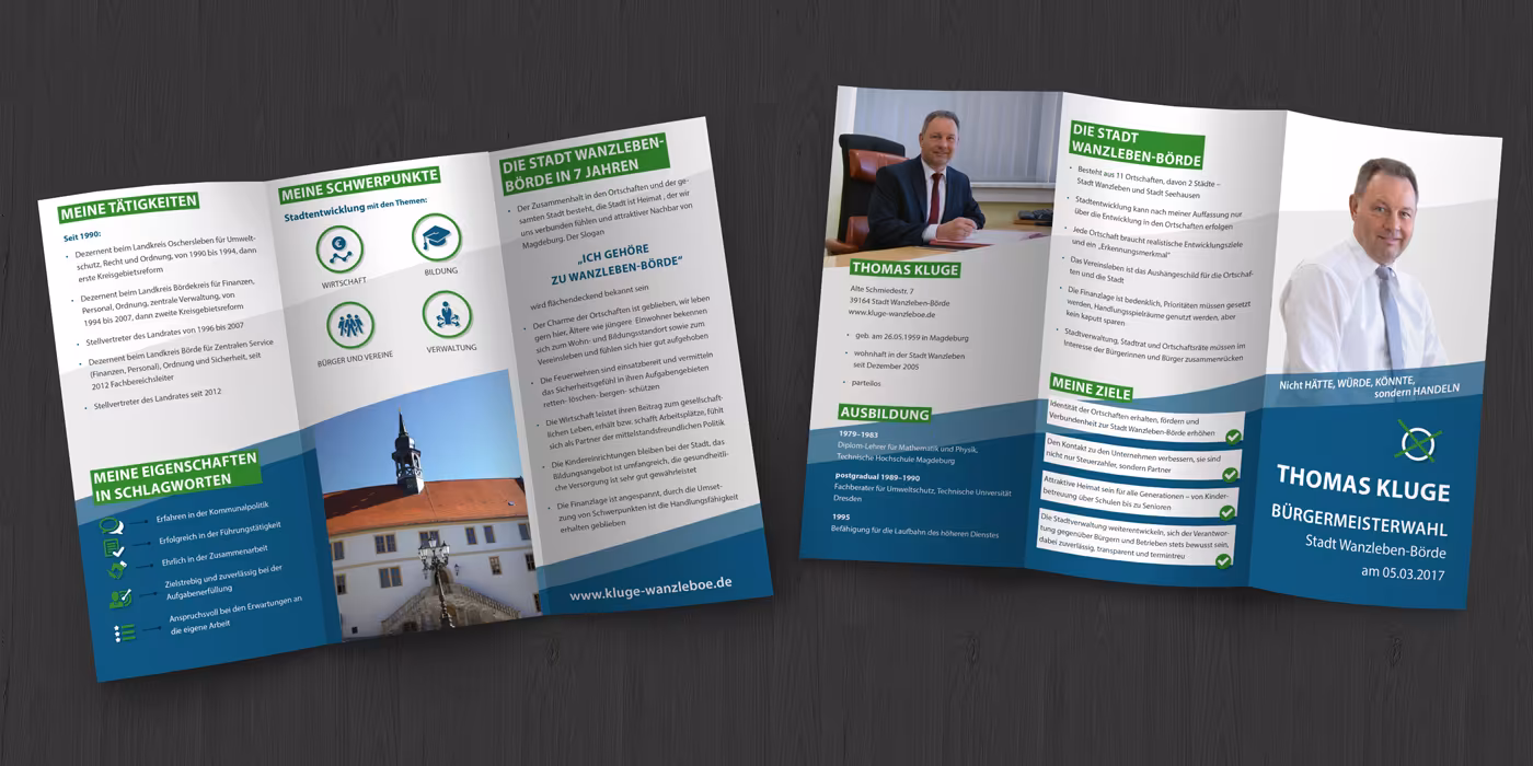
We were also allowed to support a mayoral candidate in his campaign with a folded flyer:
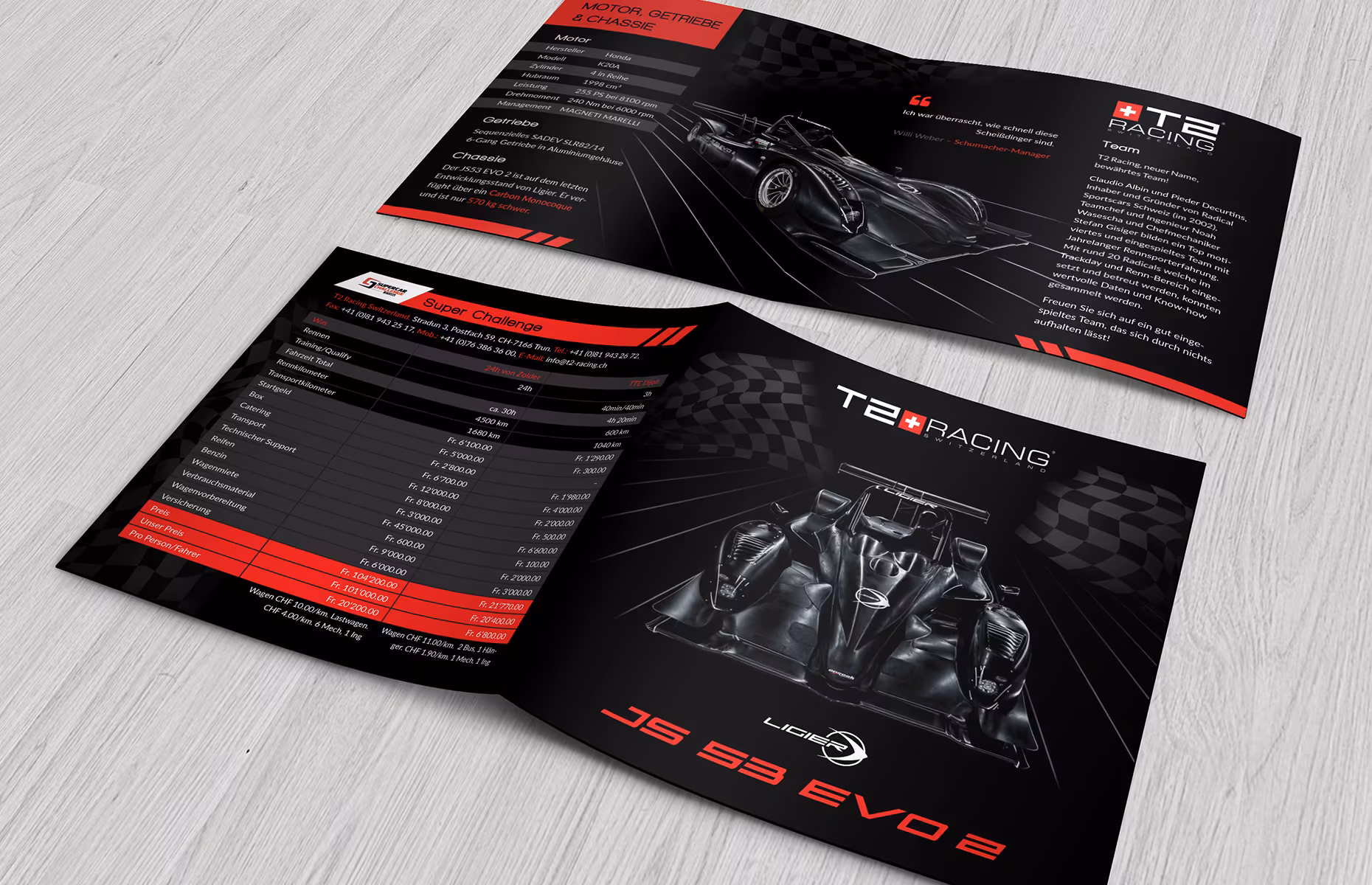
Another foldable flyer has been created for a racing team from Switzerland:
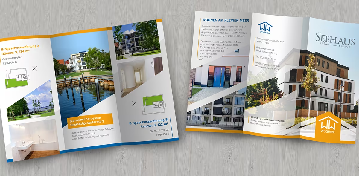
We have created a folding brochure for Wogewa in Waren.
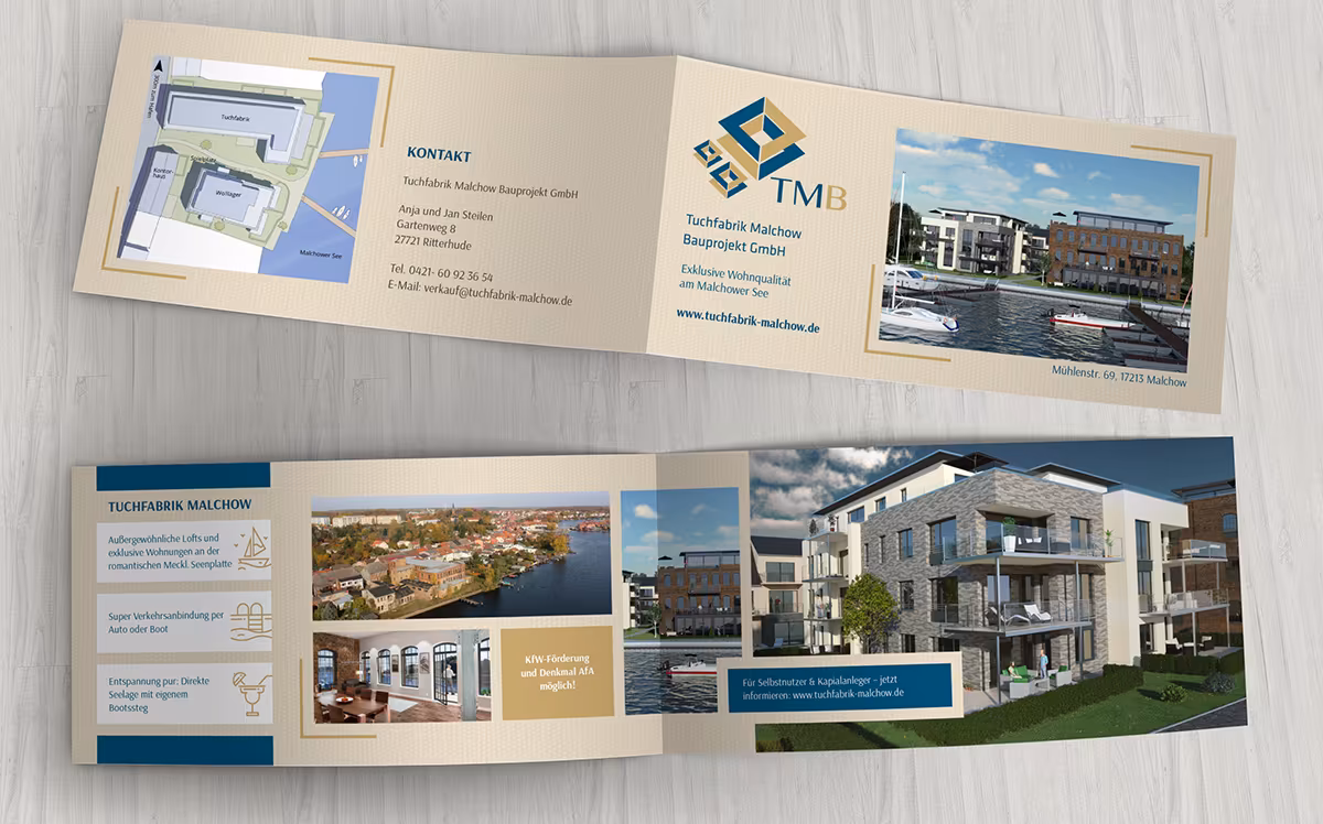
And we were also able to use our real estate expertise in the form of a flyer for the textile factory in Malchow:
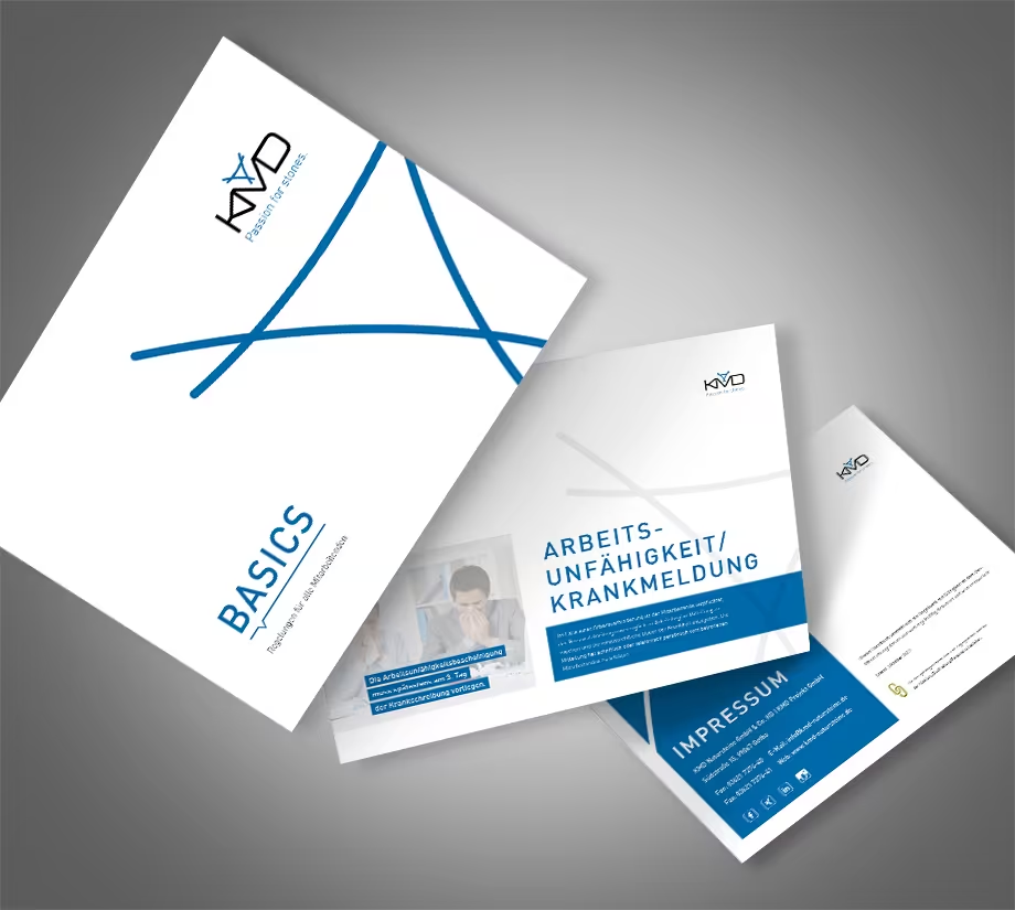
Our client KMD Natursteine from Gotha promotes itself on its website with the slogan “Passion for Stones,” but we know that their passion for good design is at least equally high! That’s why we are even more pleased that the specialist for natural stone from Gotha has included us as an agency for the upcoming design project.
The goal was to elevate internal communication to a professional level and familiarize employees with the common principles and regulations within the company through various manuals. This is achieved with minimalist employee manuals in flat design.
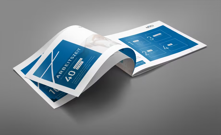
Two manuals were created in Adobe InDesign that are entirely cohesive and fully aligned with our client’s existing corporate design and identity. The first manual focuses on the basics and outlines the general rules for employees, while the second manual addresses additional services and goodies. We think it’s a great idea. This way, employees not only receive practical information but also in an aesthetically pleasing package, which promotes quick comprehension combined with a stylish design throughout all the pages.
Simple graphic design and a streamlined layout that focuses on a minimized character are incredibly important for such media. After all, this scenario particularly illustrates how essential the principle of form follows function is. Therefore, functionality takes precedence – while the design follows. Moreover, no reader benefits when oversized design is implemented, which in the worst case can completely swallow the information and render it unreadable.
The new guide for the staff of KMD Natursteine should appeal to everyone, and we, as the executing agency, are also very happy and satisfied with the result.