Development of a Corporate Identity (Brand Building & Logo Design)
Once, Kurt Wiedemann, typographer and designer, said: “A logo is good when you can scratch it in the sand with your big toe.” That’s true. Let’s take a look at how our logos have succeeded over the past years. Here are a few client projects presented, where we were also able to develop the corporate identity, above all.
The combination of regionality and theme: MV Credit
We are pleased about constructive collaborations with customers from our beautiful Müritz region, such as with Axel Krafzik. MV-Kredit was founded in 2016 by Axel Krafzik with the goal of providing borrowers and interested parties in Mecklenburg-Vorpommern and nationwide with competent and effective advice in choosing the best financing options to make wishes more tangible. Axel Krafzik commissioned us to design a modern corporate identity that reflects the values of seriousness, security, and regionality. The following visual presentation has emerged:
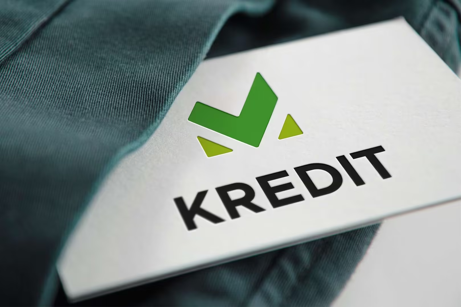
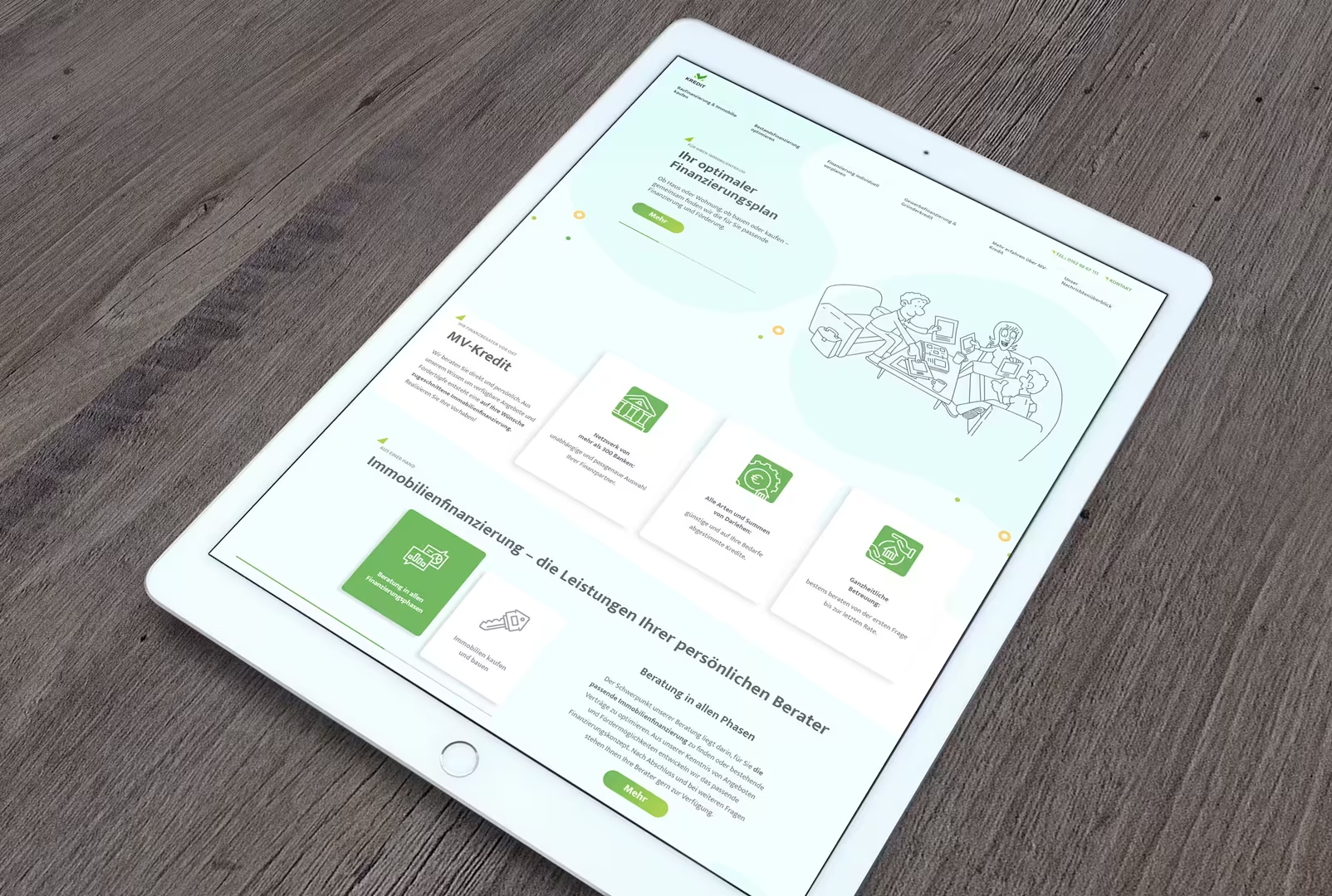
Particularly successful in this logo is the symbolic recognition of the M and V, with the upward-drawn V also achieving a certain positive checkmark effect. In the second step, we applied the corporate design to various media products such as business cards, letterheads, flyers, forms, and websites.
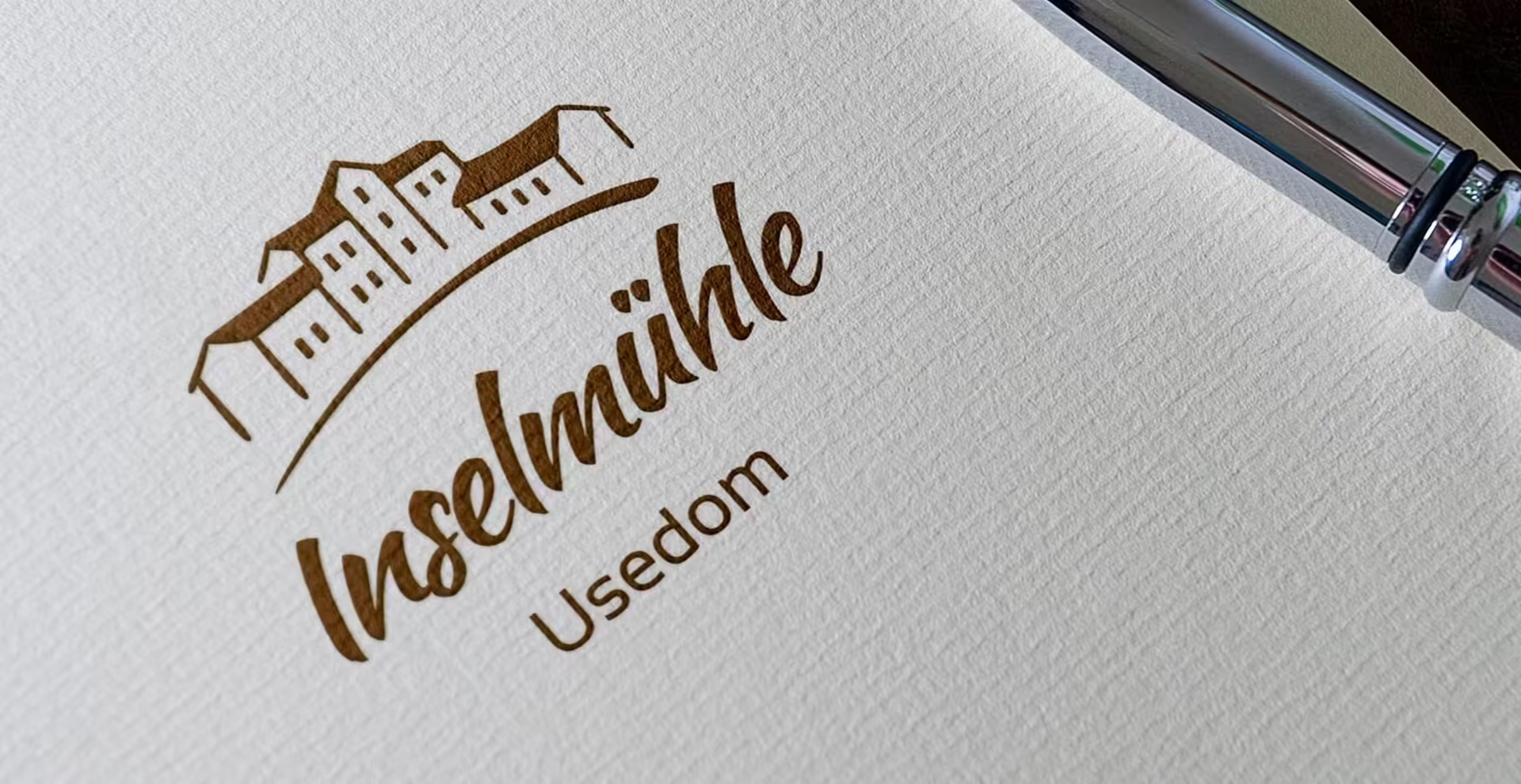
The objectified representation in the logo: Island Mill Usedom
The realization of the Usedom Island Mill has been a beautiful client project because it captures the historical building of the island mill and reflects it in an illustrative manner.
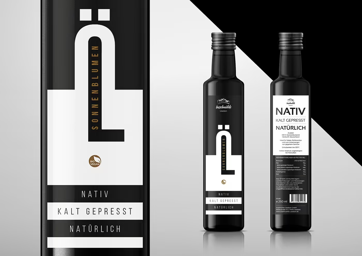
Some concept designs for bottle labels were also created for the client. Unfortunately, our favorite did not make it to the final selection but can continue to live on as inspiration in this blog post:
Coffee enjoyment in a roasted look: Kaluzny coffee machines
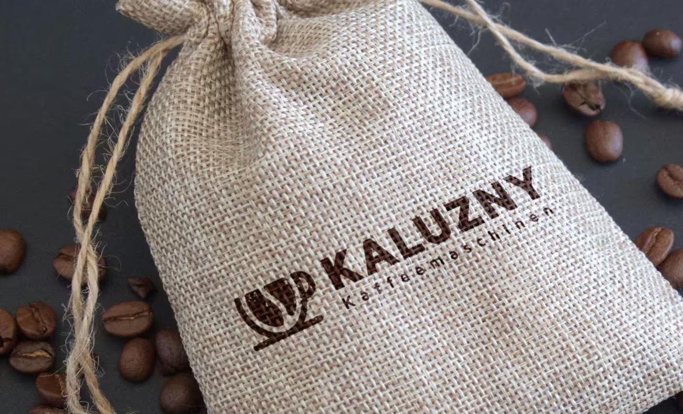
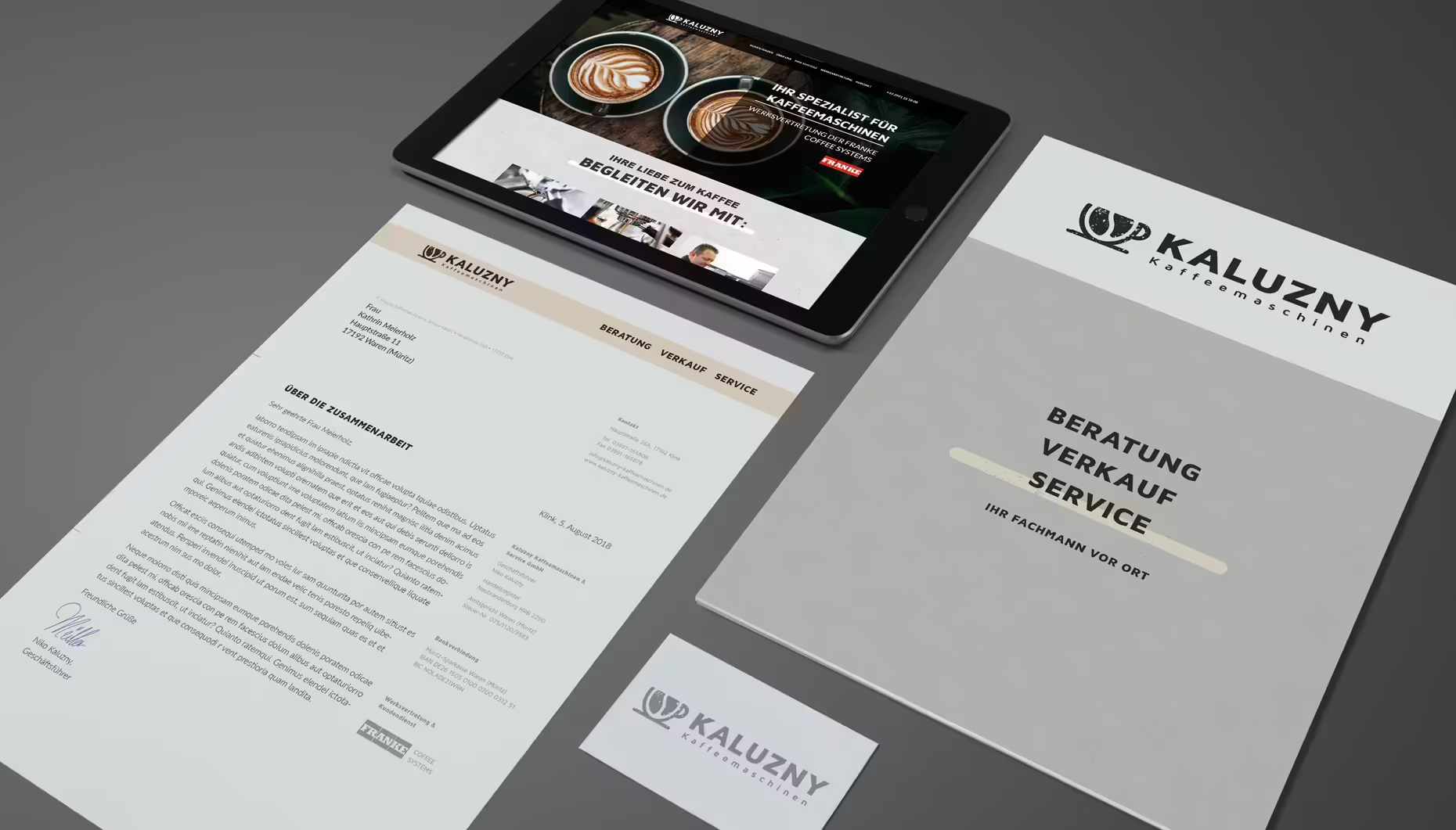
Another logo that directly captures the aroma of the business subject in a roasted look is the development of the brand for Kaluzny coffee machines.
Launched in corporate design, the new brand makes an inviting, enjoyable impression:
Rebranding and Relaunch: the Development of the Care Company MeckCura
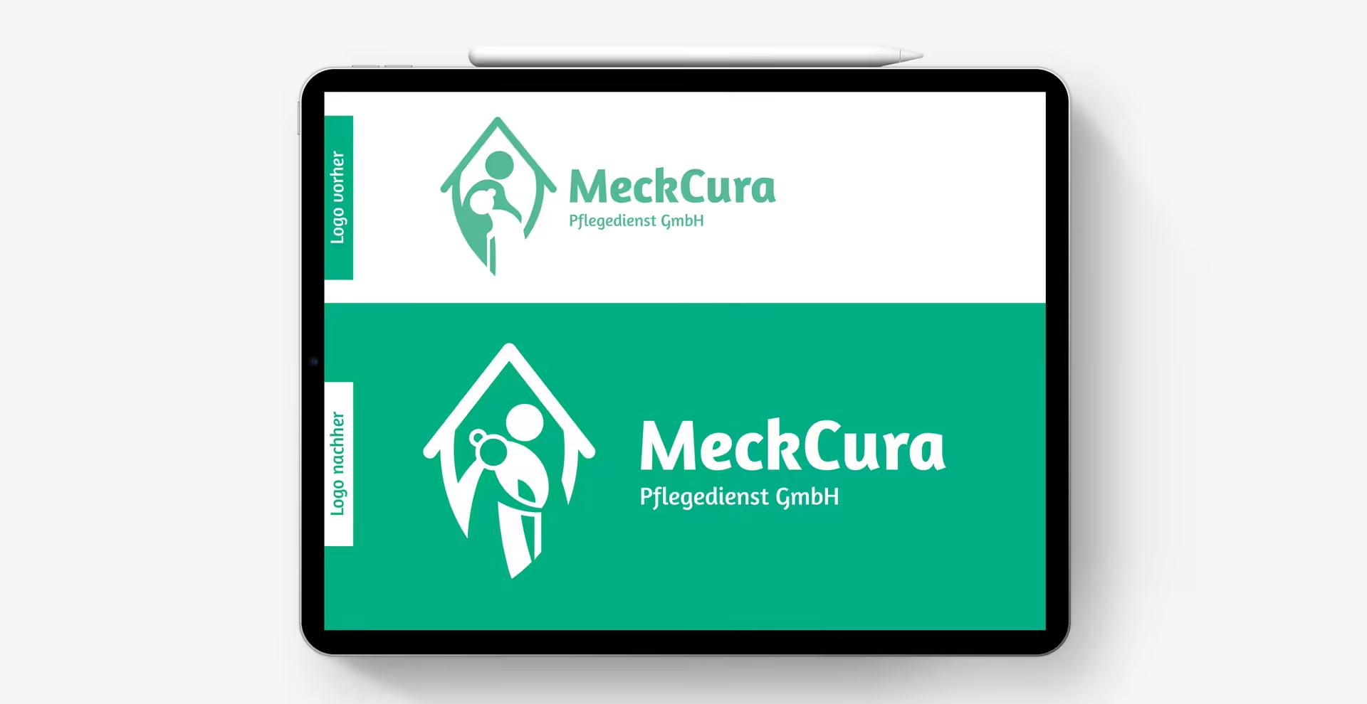
One of our favorite clients since 2016 remains MeckCura Pflegedienst GmbH, for whom we had the opportunity to develop the complete corporate identity. From the name to the fonts used, the colors, illustrations, icons, card designs, and of course the logo, as well as all print and online media.
The evolution of a logo is clearly visible in this example. With a change of shareholders, a new name and a new logo were to be created. Said and done. The image above shows the original logo we developed in 2016. After five years, when the first facelift for the website and corporate communication was due, the logo was also revisited. Instead of a bent posture towards the old lady, a helping person and the lady being cared for now move in the same direction… more upright and human than before. A beautiful positive development of the corporate identity.
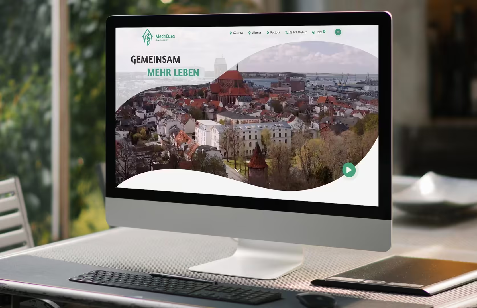
A look at the client’s website is also worthwhile, as many of our competencies have been realized for the client here:
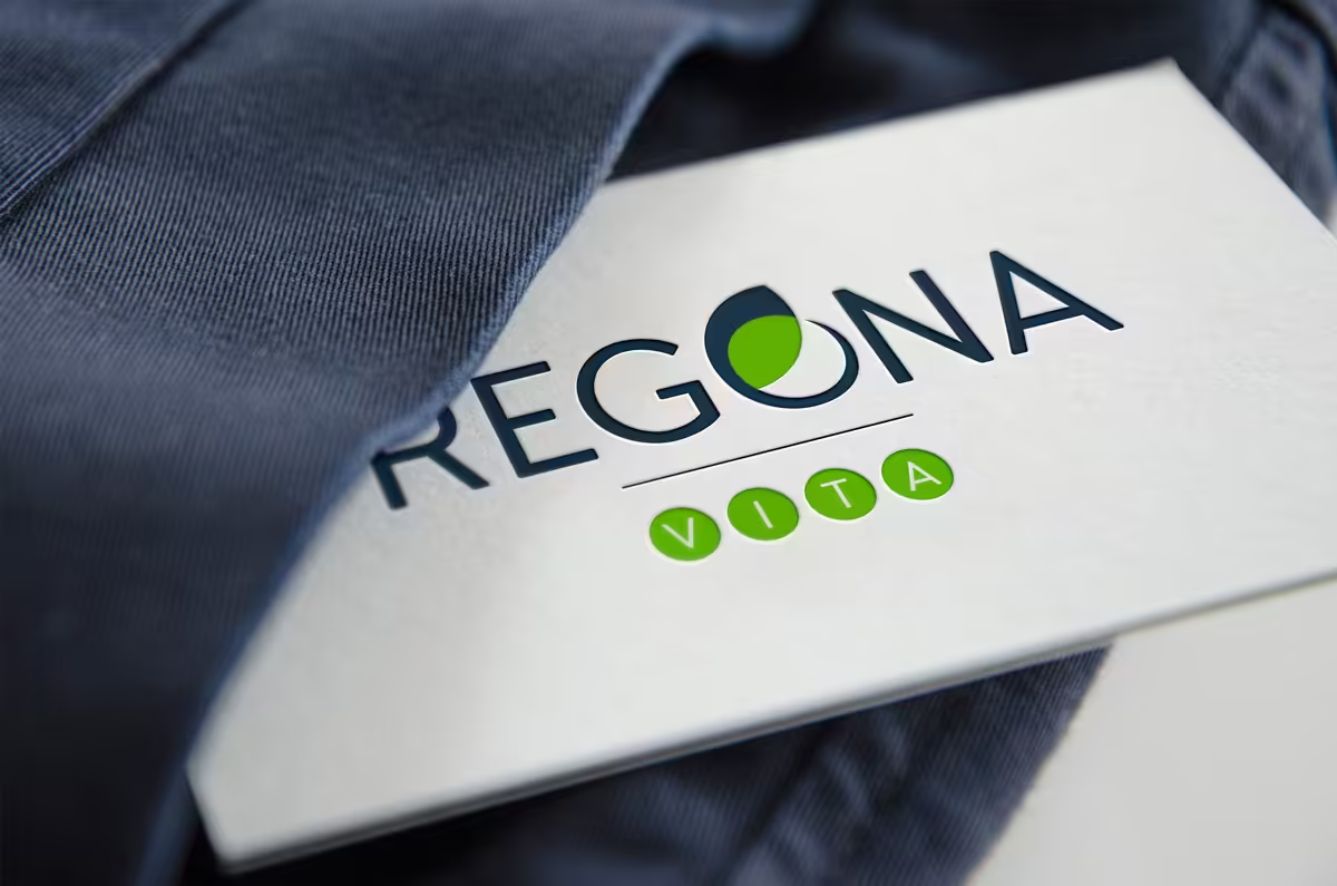
Seriousness and naturalness in one: Regona Vita
For a company in the sales of organic dietary supplements from North Rhine-Westphalia, we designed a modern logo in 2018. The choice of colors strikes a balance between seriousness and naturalness. The design of the letter O creates an illustrative and nature-related eye-catcher.
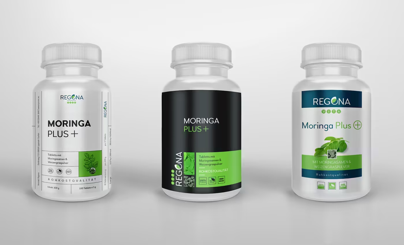
We have also developed a label concept for the company.
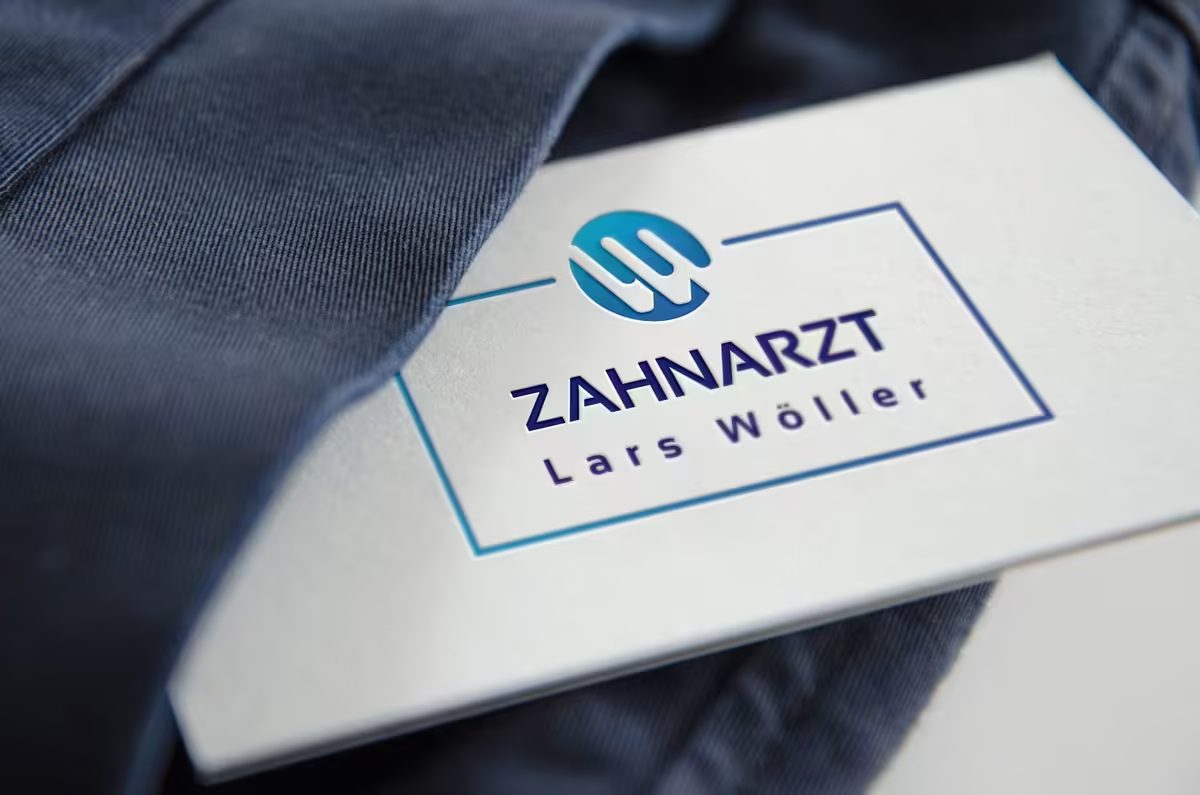
Initials of the dentist visualized as teeth: Lars Wöller in Neubrandenburg.
We have achieved a special feat with the development of the corporate identity for the dentist Lars Wöller in Neubrandenburg. There we were able to visually represent the initials as a logo in a very appealing way. Here in the mockup view (it already becomes evident that we have a favorite among our Logo-Mockups as well :-)):
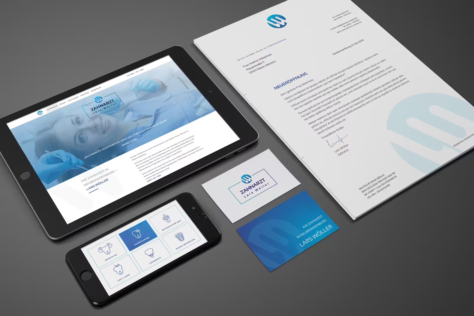
The whole thing rolled out in corporate design looks like this:
Animalistic Imprint in Logos: Personal Trainer
For a personal trainer, we created a brand inspired by an image of a panther. The result is a powerful logo, presented in an elegant corporate design:
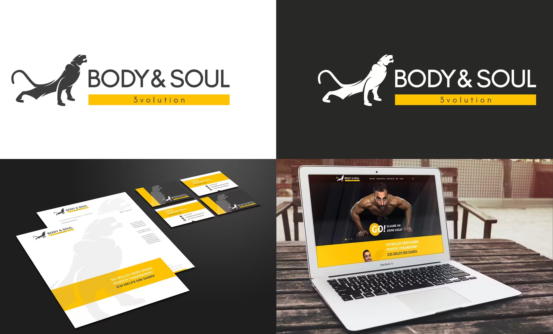
This was already the second project for a personal trainer. The first time, we drew inspiration from the mythological figure of the horse Pegasus:
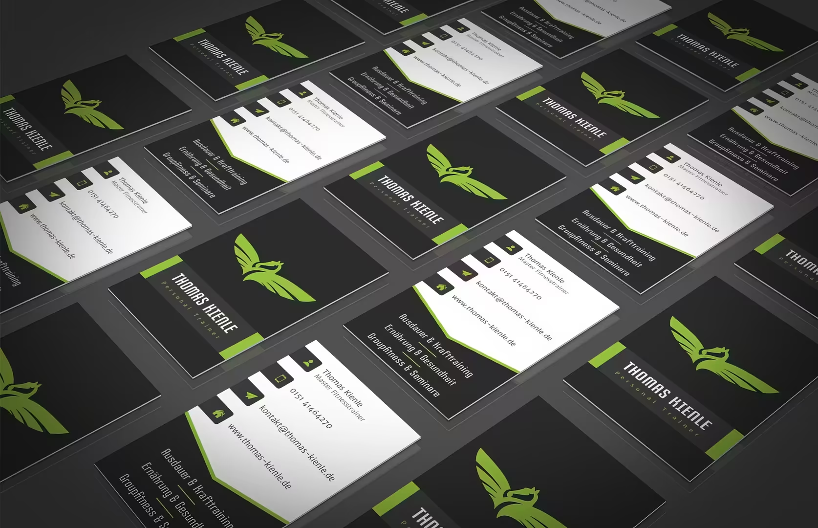
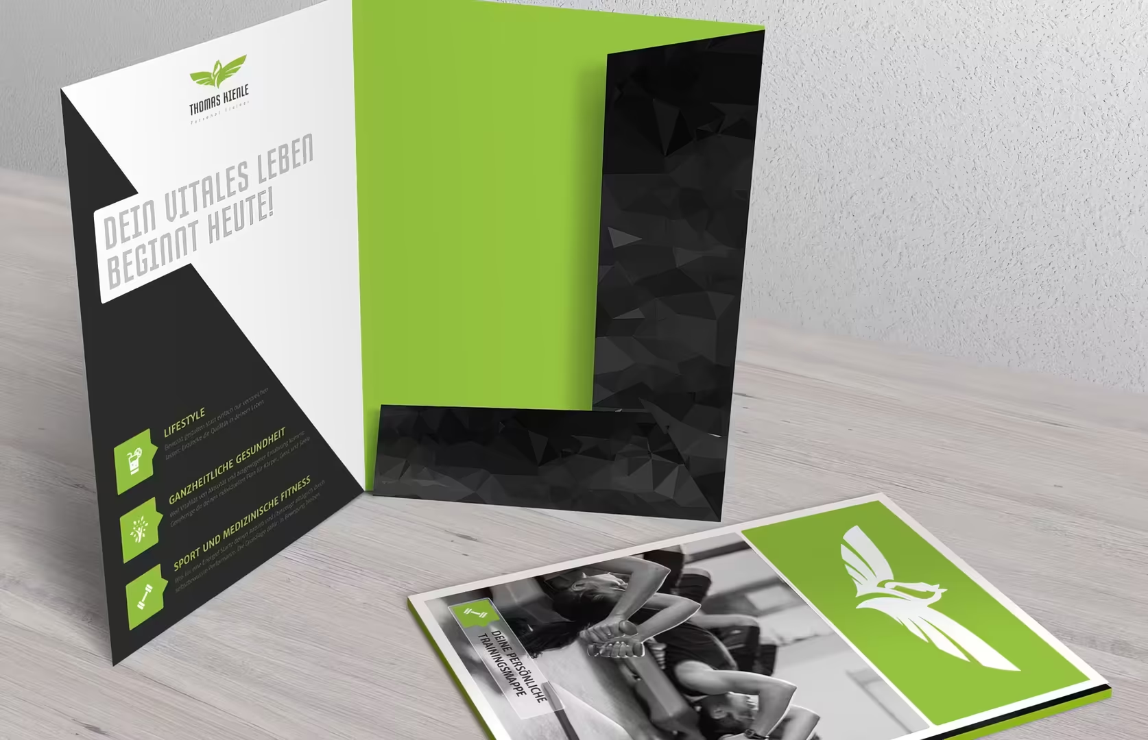
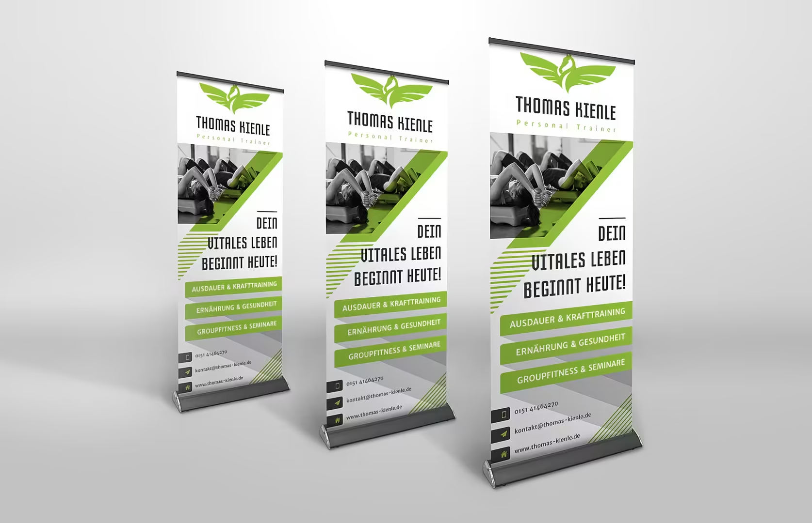
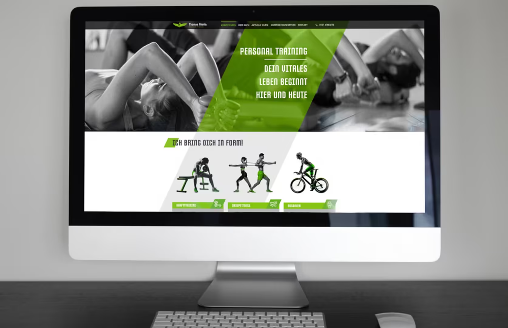
This was just a glimpse of a wide variety of logos that we have created in the past. This selection clearly showcases the range of design approaches for the concept of logos.
Cool stuff that (unfortunately) didn’t make it to the finals.
In popular parlance, it is said: “Good things take time.” It is clear to everyone that something intended to be good also requires its time, and the development of identity-appropriate corporate designs for agency clients rarely makes an exception. Often, we manage to hit the mark perfectly on the first attempt after a precise client briefing. That is, of course, fantastic; in other cases, we first navigate through individual (working) steps towards the common direction before the final logo can be celebrated in terms of form, color, and design. In this article, we want to provide insight into our logo design. In a way, it’s cool stuff that unfortunately did not make it to the final round.
Deciding what you don’t want helps on the way to figuring out what you actually do want. Viewed in this light, visualizing a logo in two or three styles leads to the client being not only satisfied but (over-)joyed in the end.
Now let’s dive into the logo gallery! The company names have been anonymized, except for TutKit.com, as it is a personal project:
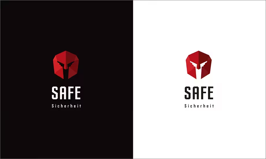
Candidate for the security industry
Safety is a truly powerful expression. When I think of the word “safety,” various concepts compete in my mind, ranging from today’s modernity back to early antiquity. Inspired by the talented and strong citizens of the Greek metropolis Sparta, we as an association represented this red ancient helmet in a modern polygonal structure. Unfortunately, in the end, the helmet didn’t win out. It remained martial. It became a shield 😉
Candidate for the food sector
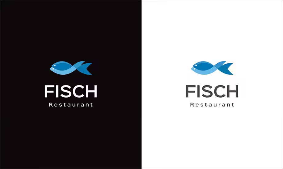
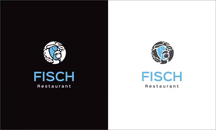
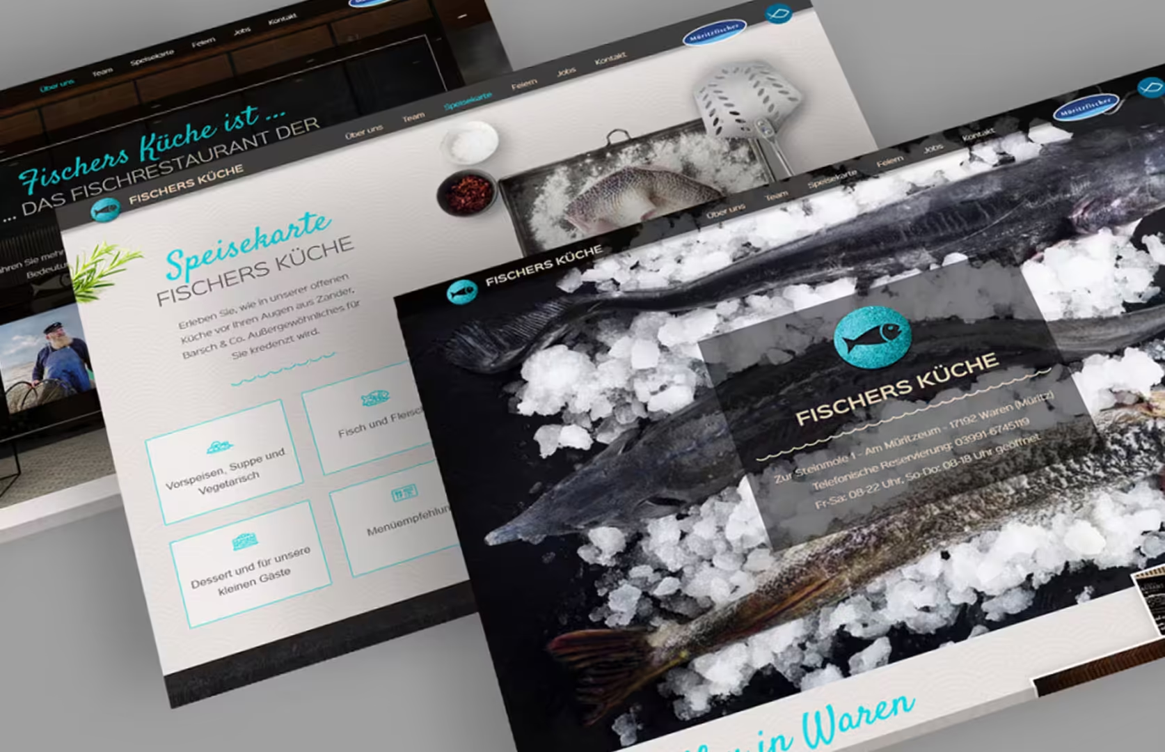
“Fish from here” was the call in the client briefing. For the opening of a new fish restaurant in Waren (Müritz), we were involved in both the spatial concept and the design and development of the brand, including the website, menu, illustrations, etc. We will present the complete project in detail on our agency page after April 1st, the restaurant’s opening date.
From this perspective, it was one of the projects where we created the greatest variety of logos. Here are three truly wonderful logos that were ultimately outshined by the final logo. Nonetheless, great results and a representation of different styles for brand development for a seafood restaurant. Which logo would be your favorite?
This is the logo that was created: a simply stylized fish on a textured background, here embedded on the website.
Do you want professional services related to brand development and logo design? Feel free to contact us today.
