Score with a modern application: we have six tips.
Since our official company headquarters was relocated from Viereck to Waren (Müritz), we have been receiving unsolicited applications every few weeks. This was also the initial spark that led us to create a package with modernen Bewerbungsvorlagen. We noticed that even people “from the industry” have difficulties selling themselves properly. Agency heads might think that if applicants can’t even convincingly sell themselves, how can they then meet the clients’ goals? For this reason, we have put together some tips for everyone applying in the creative field. Of course, these also apply to other industries where it’s important to make the best possible first impression with the application.
Score with a modern application – 6 tips
Tip 1: Find out what a standardized application should look like.
On the internet, there are countless pages on this topic. As a recommendation, I would like to mention karrierebibel.de. I also want to recommend our e-book, where we also provide qualitative Formulierungshilfen für Bewerbungen.
Tip 2: Break out
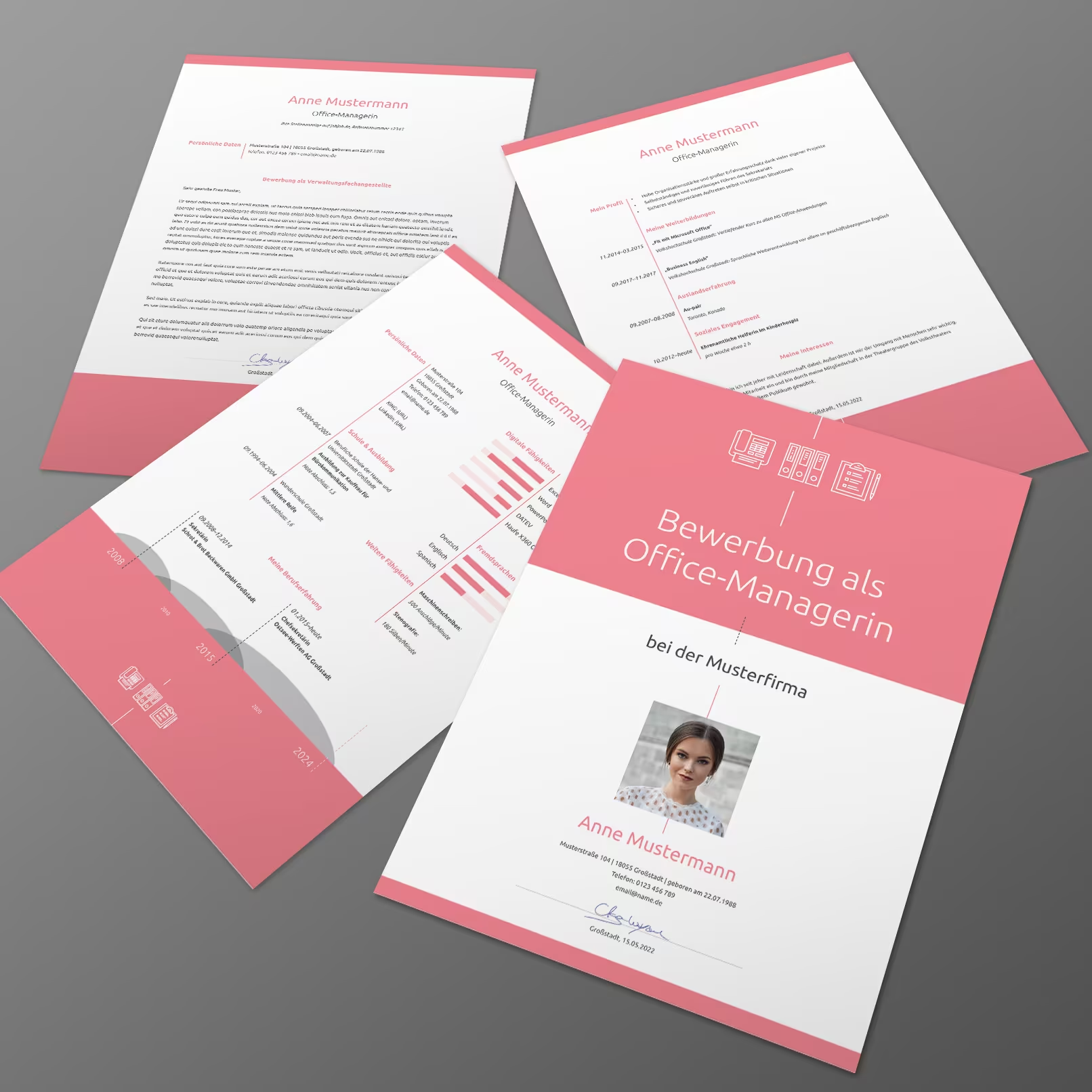
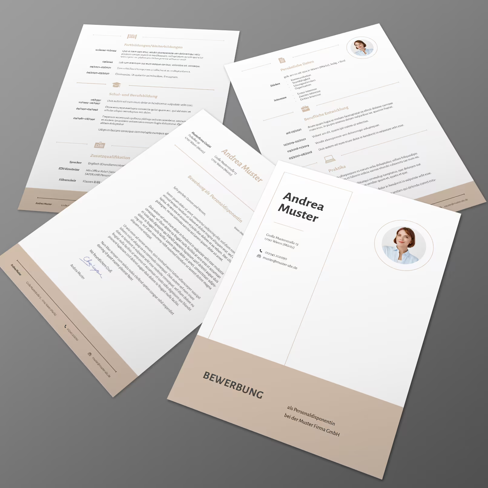
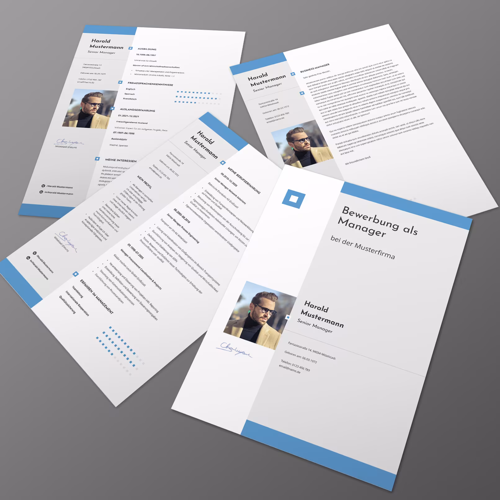
It sounds strange, but the first tip lays the groundwork for understanding the directions in which a departure from the standardized application design is even possible. On karrierebibel.de and similar sites, there are plenty of indications of what constitutes no-gos in the application process. These are the guiding principles. The problem is that if one only sticks to these, every application ends up looking uniform. The personal badges on one’s chest and lapel, which distinguish and set one apart from the crowd, are missing. Every recruiter is familiar with these uniform applications. None stand out positively, and nothing remains memorable. That’s what I mean by breaking out. While adhering to the tips on career sites is simply a must, individualization is the art. How can an application design be individualized? With our templates, we already provide examples: a pleasant full-color cover page, a modern basic layout that may deviate from DIN 5008, the use of icons, etc. The design must still remain discreet and merely form the visually appealing framework – but should not become the “work” itself. Familiarize yourself with modern Lebenslauf-Vorlagen! Ideally, everyone should also set accents with work samples in the creative industry. And this is where most struggle. On one hand, I see many examples that media designers have produced in their vocational schools – always the same motifs! On the other hand, it seems applicants haven’t thought about how an agency earns its money and what is in demand in the market.
Tip 3: Use your work samples purposefully.
I would always divide the work samples this way: half would include the preferred design style of the agency I am applying to, and I would also tailor the type of work samples accordingly. Look, I can do what you do. I fit perfectly into your team and your client projects! The other half can highlight individual strengths. So, for example, with a print-focused agency, I might also include 3D work or intros/trailers, etc. I expand your services with my skills!
I would also not include too many work samples. Definitely no more than six pages. It’s better to provide a link to the portfolio with additional work samples for each work sample category (flyers, websites, trailers, etc.). And for those who currently don’t have any really good work samples? They should create them. One should not wait until customer projects fill the portfolio. Instead of client projects, concept designs can be included in the work samples. Our Dennis also had some concept designs in his portfolio at that time, and that was absolutely fine with us. The great thing about concept designs is that clients don’t interfere, and everyone can fully express their design understanding. Which work samples would I leave out? All that feature an already outdated design trend. I would also tend to leave out political work samples.
Tip number 4: Pay attention to the fonts.
Applications using Arial just don’t work. I also saw a classic Army font in an application submitted to us. It just doesn’t fit the context! A typeface that works very well for headings (e.g., Bebas Neue) is not necessarily suitable for body text! Choose a nice font and, if necessary, a complementary accent font for the headings, and you’ll be on the right track. What is a nice font for a job application? If you can’t immediately name at least four fonts off the top of your head, trust the instincts of other designers about what is currently in style and has always been “hot!” among serif and sans-serif fonts. You can find help at: https://fonts.google.com/featured or www.fontsquirrel.com/fonts/list/hot
Another tip for the cover letter: Often the line spacing is too small. The readability suffers.
Tip number 5: Set up an online portfolio.
It is perfect, of course, when you can shine with an individual portfolio page on your own domain. Some will surely say that as designers, they only work with creative programs and that they know HTML, CSS, or JavaScript as well as Chinese, which is not at all. This is not necessarily a problem. A Tumblr portfolio is also not a real hurdle for non-developers. Alternatively, set up a portfolio at behance.net or dribbble.com. It is important that you convey the impression of seamlessly incorporating modern services into your work and leave a clean impression with your other works that are not included in the application. I would not miss this opportunity!
Tip number 6: Email address, correct company name, contact person, and more.
If you include links in your PDF application, make sure they work. It may sound silly, but I’ve experienced it. The link worked with copy and paste, but unfortunately not with a direct click. However, no one is going to copy and paste when the mouse pointer shows a hyperlink, and then clicking leads to a 404 page.
Correct spelling and grammar should be a matter of course, but sometimes the company address or the contact person is misspelled. Generally, it’s better to address contact persons rather than just using the usual “Dear Sir or Madam.” Often, the application itself is error-free, but the written communication via email has errors, that is, it is unedited.
Your scans of certificates must always be straight. So please straighten the attachments. I often also see slight gray gradients on the scans. I would always correct that digitally.
For your email address, it’s best to choose a name format like firstname.lastname@your-mail-provider.com. Also, choose a provider that doesn’t automatically include a promotional signature in your email text. This brings us back to your own website. Emails with your website name in the mailing address appear optimal. Make sure that when sending an email, there are a maximum of two attachments in PDF format. You can find out how to combine all documents in a PDF zusammenfügen by clicking on the link.
Anyone interested in our Bewerbungsvorlagen can find many packages with different design templates in our shop. They are suitable not only for the creative industry but also for many other sectors. Just take a look at them: Moderne Bewerbungsvorlagen zum Download
These were some tips. If you want to change, I hope that I was able to help a little with these few remarks and that your chances of being invited for an interview will increase.
In another blog post, we highlighted the 10 typischen Fehler in einer Bewerbung an einem echten Beispiel. Perhaps this post is even more interesting for you? Feel free to check it out!