From day one, working with 4eck Media has been a very professional and engaging experience. I was more than impressed by their numerous creative ideas. Many thanks to the entire 4eck Media team!
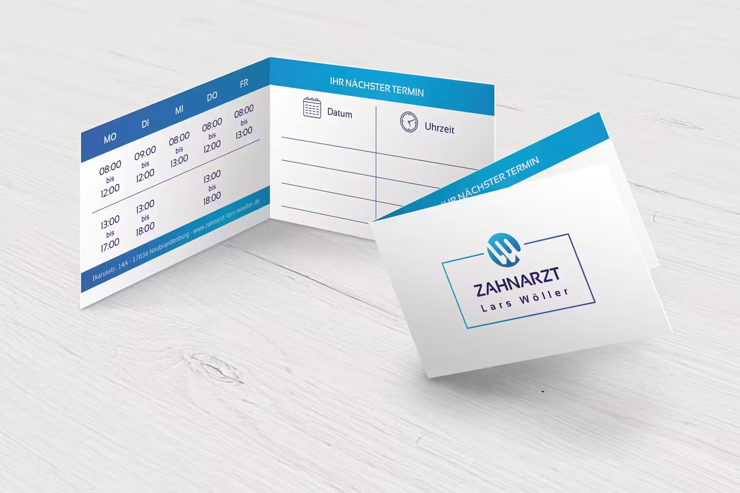
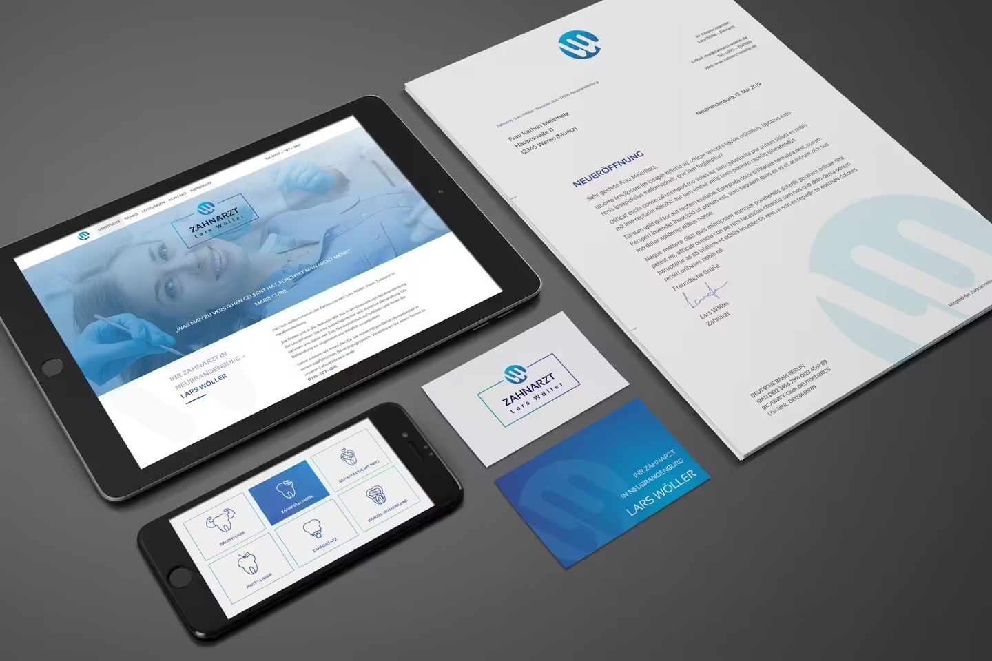
Corporate identity for a new dentist in Neubrandenburg.
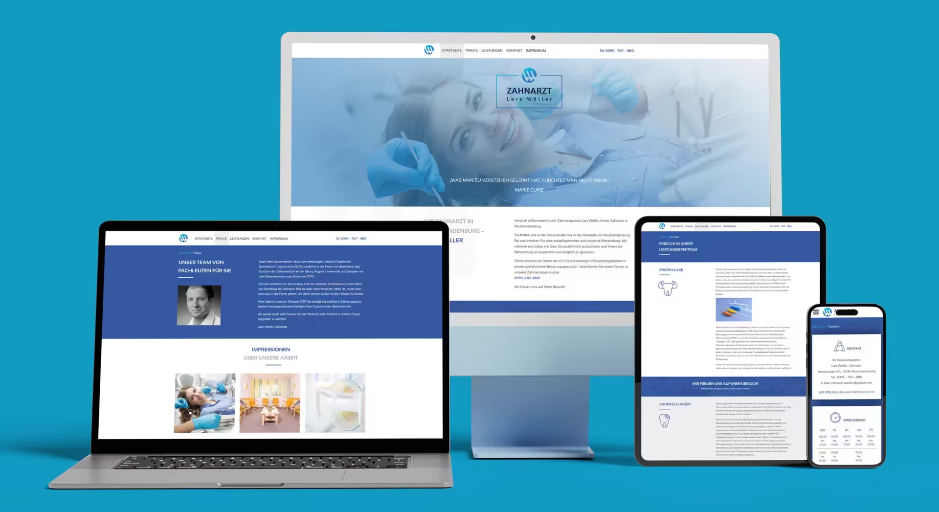
After completing his dental studies in Göttingen, Lars Wöller worked near Bamberg in Bavaria before returning to his homeland in Mecklenburg-Vorpommern, where he took over Gudrun Keller’s practice in Neubrandenburg in the Mecklenburg Lake District in October 2017. Our agency, specialized in health marketing, was responsible for the design of the corporate identity, including logo design, icon design, and website development.
No green apple, no toothbrush.
In the initial briefing, Lars Wöller made it clear that he did not want a green apple or a toothbrush as a visual identity. Instead, the corporate design should appear fresh and modern. This was not an easy task, as one inevitably thinks of healthy teeth and biting when it comes to a dentist (well known is the Granny Smith apple from the advertisement, which is, by the way, trademarked and cannot be used as a logo). How did we solve it?
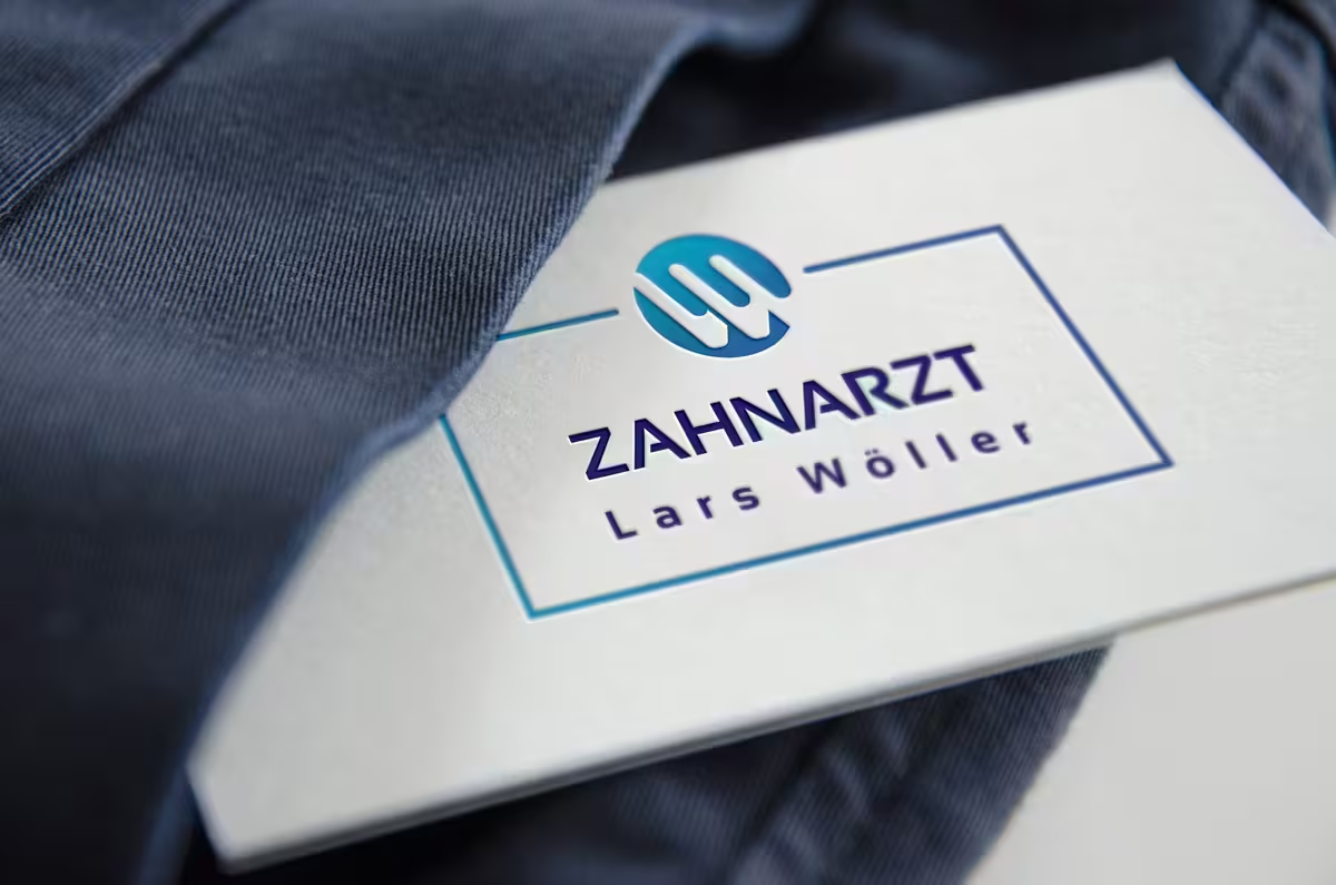
A logo that looks tempting to bite.
We decided to connect the brand positioning with teeth and the name of the dentist. The design language of the logo thereby has a double meaning: on one hand, teeth are visualized in a pictogram-like manner for thematic branding, while on the other hand, it is precisely the initials LW of the dentist Lars Wöller that now shine in the logo. The viewer may only realize this on a second glance, making the positive surprise all the more effective. Isn’t that more exciting than a green apple?
At a glance
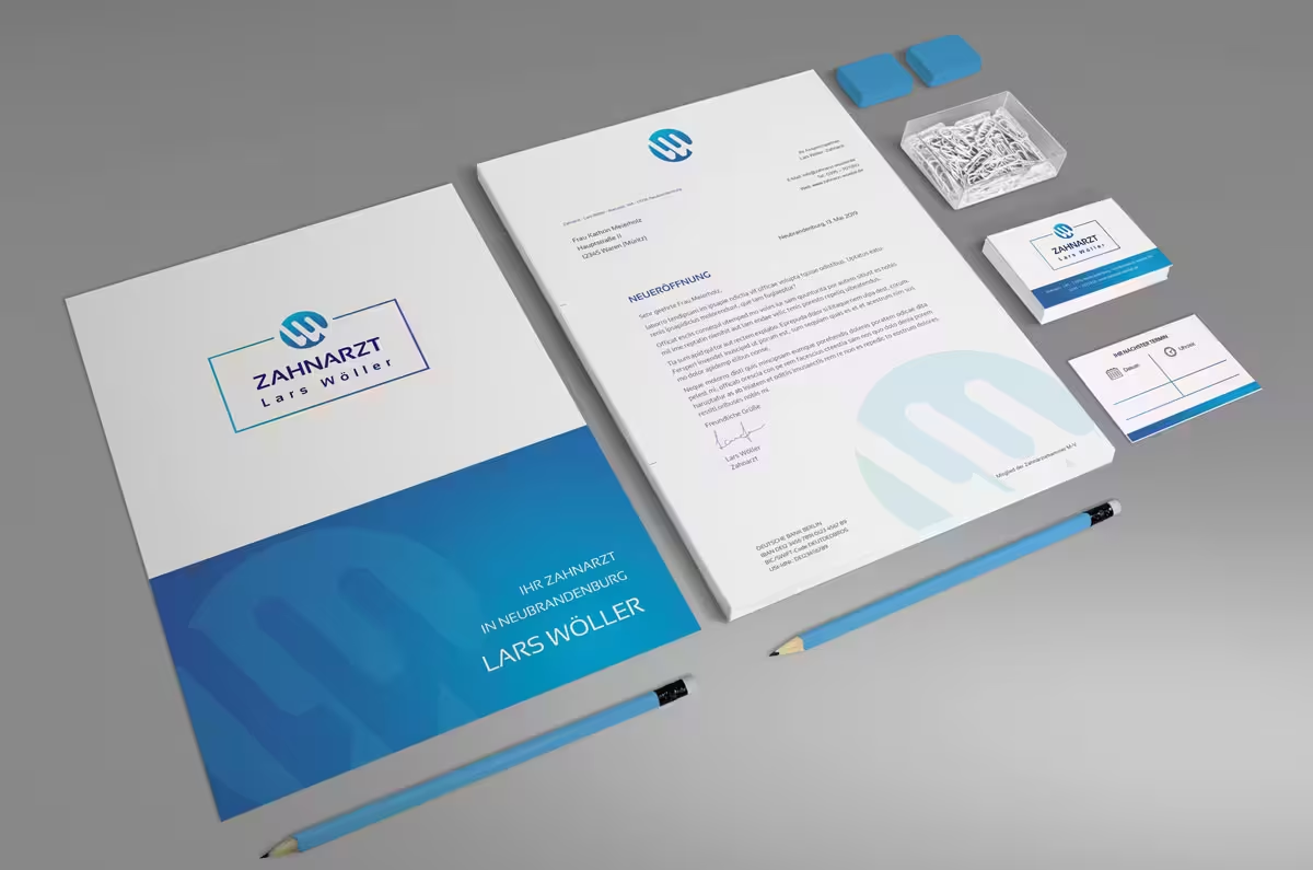
- Corporate identity with logo design, form language, fonts, and color determination.
- Icon design and illustration
- Design of folding business cards and letterhead
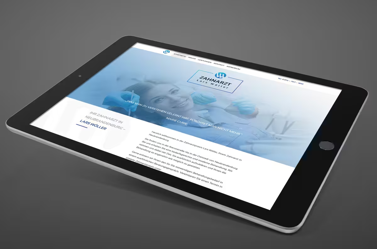
- Concept, design, and website development < 0 > www.zahnarzt-lars-woeller.de based on WordPress.
- SEO optimization for local search results (Google for Business)
- Mobile & Performance Optimization
